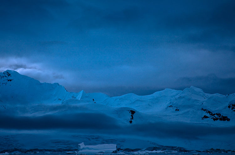
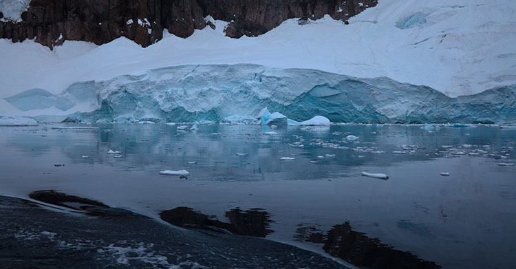
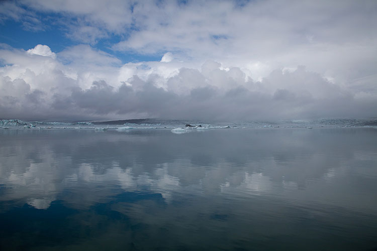
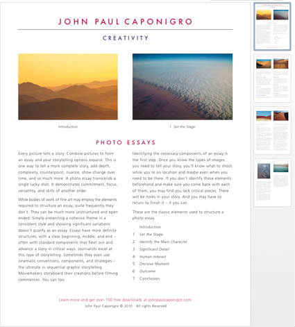
Neko Harbor, Antarctica, 2007
Watch how the focus shifts when these alternate titles are used.
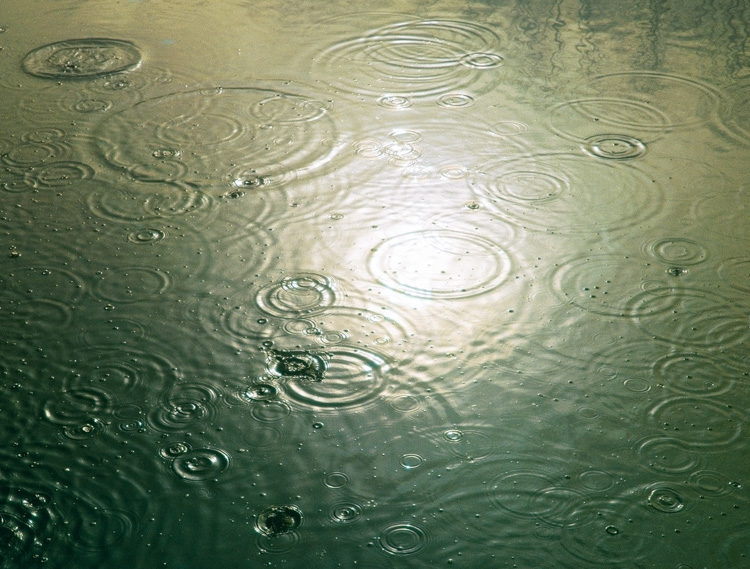
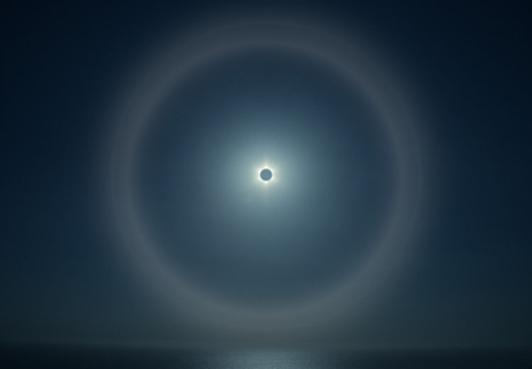
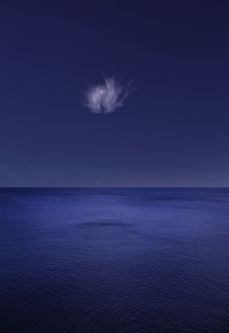
Freezing Point, Glacial Retreat, Blue, Constellation
When in doubt, when selecting titles for your images keep them simple and neutral. Less is more, more or less.
Good titles complement works by giving viewers more relevant information that makes their experience richer, indicating its creator’s relationship towards a subject and medium and audience, suggesting but not limiting attention to dimensions of a work that might otherwise remain overlooked, all the while leaving room for viewer’s extended interpretation.
Bad titles dominate or subvert works by attempting to make up for what’s missing, focus attention on one aspect of work and deflect attention from others, add heavy-handed interpretation leaving less room for viewer participation, or tell viewers rather than show them.
To avoid bad titles, rather than becoming a master of language, keep it simple. While there are notable examples where this maxim has been defied with success – singer/songwriter Fiona Apple titled one of her albums with a complete poem containing over four hundred characters causing a buzz-worthy stir which reinforced her reputation for being both poetic and eccentric – at a minimum, it takes a significant flair for style or even genius to pull a stunt like this off.
You might be tempted to keep it really simple. Remember, Untitled is still a title. It’s the most neutral to the point of being nondescript and almost uninformative. Sometimes it works – well. Many times, it’s not enough. But eliminating it altogether and simply stating the medium used is almost always never enough.
In a majority of cases, just a little more will do just fine. The classic convention for titling an image is to identify the subject (name the person, place or thing) and add the date of creation: if it’s a photograph use the date of exposure; if it’s a painting use the date of completion; if it’s a composite photograph default to the latter; if it’s an image of a historic event add the date of the event in the first part of the title and add the date of completion of the image.
It’s the times when this convention doesn’t fit that more creativity is warranted.
Use this list as a springboard for exploring your options.
1 List the subject and date – Neko Harbor, Antarctica, 2007.
2 State a relationship to the subject, yours or someone else’s; i.e. My Mother or Her Home.
3 Use a general category for the subject rather than an individual one, such as Statistic.
4 Name a formal element in the work – number, shape, color, size, etc.
5 Refer to another medium, such as poetic or musical form.
6 Loosely interpret the subject; similes and metaphors often work well here, such as Smells Like Teen Spirit.
7 Use a technical term, related to the subject or the creation of the work, Ascent or Descent for example.
8 State what the subject is not – Is Not Untitled.
9 Create a contradiction – think of Magritte’s famous painting of a pipe entitled This Is Not A Pipe.
You’ll no doubt find ways to expand this list.
It’s interesting to note that when you keep it simple and conventional, specificity works in your favor, yet the more creative and unconventional you get the more ambiguity, sometimes coupled with a dose of irony or contradiction, works in your favor
You may hit upon one ingenious title. If you should be so lucky quickly ask yourself, “Can you repeat it?” One genius title amid a cluster of duds will stand out like a sore thumb. Bodies of work beg some consistency. That said, you may find that varying your titling conventions between different projects is an effective way to further differentiate them.
Consider creating a standard for your titles, after giving considerable thought to both its short and long-term effects on the way audiences will respond to you work. There are many benefits to creating a consistent practice, including the creation and fulfillment of expectations and the reduction of the time and energy you put into resolving new terms. This will also call more attention to the times when you deviate from your standards, which can be advantageous if used strategically.
Like your art, titles are all about communication. Titles become a part of your art. Make sure your titles make a contribution to effectively communicating what you want to communicate. It’s worth the time you invest to put some thought into how you title your work.
How do you title your work?
Read How I Title My Images.
Read more about how writing can help stimulate your creativity.
Learn more in my digital photography and digital printing workshops.