The Best Deal I've Ever Offered On My Prints

IlluminationXXXI_425
Members of my newsletter Collectors Alert just received a very special offer. Two prints for one very low price. It’s the best deal I’ve ever offered.
Collectors Alert will give you previews of new images, tell you the stories behind them, offer you special discounts, and alert you about upcoming exhibits and publications.
Sign up for my newsletter Collectors Alert here.

Inquire by emailing me at jpc@johnpaulcaponigro.com.

Alumnus Michael J Quinn’s New Print Portfolio

Quinn_2 Quinn_5
I have been honing my photographic skills over the last several years. Making strides in composition, storytelling and mechanics of photography, I still lacked some finer processing skills and the art of printing. I decided that a print is the ultimate goal of a photographer. There is just something very tangible, very permanent about a print. Anybody can flick through a series of images on an electronic device. But actually taking the time to make a print, matting, framing, hung on the wall and lit well -takes considerable more effort. It also then requires more contemplation by the audience. I think they place more weight and value on the print than in electronic form. They are more willing to commit more time with the print.

During the span of a year, I completed both of John Paul’s Intermediate and Advance printing classes. At that point, I believed that I had achieved the skills required to attempt my own Print Portfolio.

There is just something substantial about the physical print. Let’s face it, we can casually look through tons of images on our electronic devices. They are there and then gone. But having a book full of prints is something completely different. You engage two more of your senses, touch, and smell. Every book has a certain feel and personal experience to it. It evokes more of an emotional response than the electronic equivalent.

So my goal with this project was severalfold.
1. Create a body of work of 24 images
2. Improve my image processing
3. Improve my print quality / skills
4. Share with as many people as I can
A decision had to be made on the format of the book. Landscape, Portrait, or Square. I deiced that the square format was the most versatile of the three. With a square book, I could print any aspect ratio that I wanted and not feel constrained to a particular style. Since I knew this book was going to be a work in progress and may change over time, I thought being versatile was a good trade-off versus being locked into a portrait or landscape format.

The next decision that I had to make was the size of the book. I based this partly on the common size of paper available. The other influence was what kind of reaction I wanted from people when they viewed the book. I made 5 prints on 13×14 inch and 17×18 inch papers and then just stapled them together to simulate the two sizes of the book I was considering. I printed horizontal, vertical and square images. I had my own opinion and then solicited several peoples opinions. The larger size won hands down. You would not think that 4 extra inches would make that dramatic of a difference but it really did. It took the scale of the book from something casual to something cherished. The larger size was just so much more engaging.

The paper choice for my Epson 9900 printer, (after some experimentation) Epson Ultrasmooth. It brought an extra dimension of depth to my ice images. The warmth of the paper gave an extra separation to the printed images. I decided that the easiest form factor would be to use 17″ wide roll paper. Then I would just allow the printer to cut the sheets to a length of 18″. This way I would not have to do any post printing trimming of the prints.

For the physical book, I had a custom binding post book and slip cover made. I choose the binding post style so that it would be easy to replace prints and so that I could completely change the theme of the book if I desired. For materials I choose Black on Black on Black. This might be generic, or called corporate, but I liked the neutrality of it and its future potential. Each of the three surfaces were a different material, so that added a subtle variation to the book. I added just a splash of Red into my debossed logo. The inner front and back sheets are sanded mylar. This essentially adds an end sheet to the book and enhances the experience when opening the book.

Quinn_3
Quinn_4
I learned a lot through this process. It was a great growth experience. Having a project focuses your mind and creativity. Completing a project gives you a sense of accomplishment. Sharing the experience – I hope I can inspire all of you to do something wonderful.

Find out more about Michael J Quinn here.

27 Quotes By Photographer Gary Winogrand

 
Enj0y this collection of quotes by photographer Gary Winogrand.
“Photography is not about the thing photographed. It is about how that thing looks photographed.” – Garry Winogrand
“The photo is a thing in itself. And that’s what still photography is all about.” – Garry Winogrand
“I photograph to find out what something will look like photographed.” – Garry Winogrand
“I have a burning desire to see what things look like photographed by me.” – Garry Winogrand
“Photography is about finding out what can happen in the frame. When you put four edges around some facts, you change those facts.” – Garry Winogrand
“In the end, maybe the correct language would be how the fact of putting four edges around a collection of information or facts transforms it. A photograph is not what was photographed, it’s something else.” – Garry Winogrand
“The photograph should be more interesting or more beautiful than what was photographed.” – Garry Winogrand
“There is nothing as mysterious as a fact clearly described I like to think of photographing as a two way act of respect. Respect for the medium, by letting it do what it does best, describe. And respect for the subject, by describing it as it is. A photograph must be responsible to both.” – Garry Winogrand
“What I write here is a description of what I have come to understand about photography, from photographing and from looking at photographs. A work of art is that thing whose form and content are organic to the tools and materials that made it. Still photography is a chemical, mechanical process. Literal description or the illusion of literal description, is what the tools and materials of still photography do better than any other graphic medium. A still photograph is the illusion of a literal description of how a camera saw a piece of time and space. Understanding this, one can postulate the following theorem: Anything and all things are photographable. A photograph can only look like how the camera saw what was photographed. Or, how the camera saw the piece of time and space is responsible for how the photograph looks. Therefore, a photograph can look any way. Or, there’s no way a photograph has to look (beyond being an illusion of a literal description). Or, there are no external or abstract or preconceived rules of design that can apply to still photographs. I like to think of photographing as a two-way act of respect. Respect for the medium, by letting it do what it does best, describe. And respect for the subject, by describing as it is. A photograph must be responsible to both.” – Garry Winogrand
“Photographers mistake the emotion they feel while taking the picture as judgment that the photograph is good.” – Garry Winogrand
“If I saw something in my viewfinder that looked familiar to me, I would do something to shake it up.”- Garry Winogrand
“You see something happening and you bang away at it. Either you get what you saw or you get something else – and whichever is better you print.” – Garry Winogrand
“There is no special way a photograph should look.” – Garry Winogrand
“A photograph can look any way.” – Garry Winogrand
“Every photograph is a battle of form versus content.” – Garry Winogrand
“Photos have no narrative content. They only describe light on surface.” – Garry Winogrand
“For me the true business of photography is to capture a bit of reality (whatever that is) on film… if, later, the reality means something to someone else, so much the better.” – Garry Winogrand
“I don’t have messages in my pictures…The true business of photography is to capture a bit of reality (whatever that is) on film.” – Garry Winogrand
“I don’t have anything to say in any picture. My only interest in photography is to see what something looks like as a photograph. I have no preconceptions.” – Garry Winogrand
“I get totally out of myself. It’s the closest I come to not existing, I think, which is the best – which is to me attractive.” – Garry Winogrand
“I really try to divorce myself from any thought of possible use of this stuff. That’s part of the discipline. My only purpose while I’m working is to try to make interesting photographs, and what to do with them is another act – an alter consideration. Certainly while I’m working, I want them to be as useless as possible.” – Garry Winogrand
“No one moment is most important. Any moment can be something.” – Garry Winogrand
“The only thing that’s difficult is reloading when things are happening. Can you get it done fast enough?” – Garry Winogrand
“There are no photographs while I’m reloading” – Garry Winogrand
“You have a lifetime to learn technique. But I can teach you what is more important than technique, how to see; learn that and all you have to do afterwards is press the shutter.” – Garry Winogrand
“There are things I back off from trying to talk about, you know. Particularly my own work. Also, there may be things better left unsaid. At times I’d much rather talk about other (people’s) work.” – Garry Winogrand
“Great photography is always on the edge of failure.” – Garry Winogrand
 View 12 Great Photographs By Gary Winogrand here.
Read more in The Essential Collection Of Photographer’s Quotes.

41 Quotes On Mystery

0_Quotes_Mystery

Here’s a collection of my favorite quotes on mystery.

“Mystery creates wonder and wonder is the basis of man’s desire to understand.” – Neil Armstrong

“The possession of knowledge does not kill the sense of wonder and mystery. There is always more mystery.” ― Anaïs Nin

“As we acquire more knowledge, things do not become more comprehensible, but more mysterious.” – Albert Schweitzer

“Mysteries abound where most we seek for answers.” – Ray Bradbury

“Without mysteries, life would be very dull indeed. What would be left to strive for if everything were known?” – Charles de Lint

“I’m for mystery, not interpretive answers. … The answer is never the answer. What’s really interesting is the mystery. If you seek the mystery instead of the answer, you’ll always be seeking. I’ve never seen anybody really find the answer, but they think they have. So they stop thinking. But the job is to seek mystery, evoke mystery, plant a garden in which strange plants grow and mysteries bloom. The need for mystery is greater than the need for an answer.” – Ken Kesey

“Mystery is a resource, like coal or gold, and its preservation is a fine thing.” – Tim Cahill

“The most beautiful thing we can experience is the mysterious. It is the source of all true art and science. He to whom the emotion is a stranger, who can no longer pause to wonder and stand wrapped in awe, is as good as dead — his eyes are closed. The insight into the mystery of life, coupled though it be with fear, has also given rise to religion. To know what is impenetrable to us really exists, manifesting itself as the highest wisdom and the most radiant beauty, which our dull faculties can comprehend only in their most primitive forms—this knowledge, this feeling is at the center of true religiousness.” ― Albert Einstein

Read More

Alumn Cira Crowell – Exhibition & Book – "Envisioning Ecstasy"

Cirrus Above Thiksey

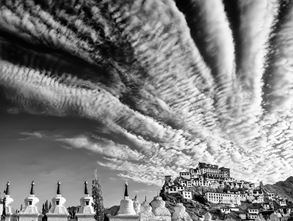
In the summer of 2013 I had the fortune of travelling to Ladakh, India, a remote Himalayan kingdom that is now far Northwestern India, bordered by Pakistani controlled Kasmir and Chinese controlled Tibet.  Ladakh’s high desert rises from valley floors at 12,000 feet to the mountain peaks at 20,000ft. Water from the Indus River is skillfully directed through lush fields then on to irrigate countless other valleys in India. The Ladakhis live in carefully organized communities of adobe homes where they maintain cattle and yak, pashmina goat herds, make mud bricks for export, hone their traditional crafts, keep cultural ways of life and practice an intense spirituality.  It is a place where monasteries seem to float above military bases and vast expanses that shimmer in the intense, clear light. Translated as “The Land of High Passes” Ladakh is a region of sunshine and snow, of dark temples and bright spirits.

I happened to meet fellow photographer Christopher Michel in Delhi when he was doing what he does best, photographing people with his happy-go-lucky-how-could-you-say-no direct approach.  We happened to have the same somewhat unusual camera and lens combo so I struck up a conversation.  Little did I know we would be traveling to the same place and often shooting standing shoulder to shoulder with several thousand other people.

Faster and Faster

One hundred and fifty thousand ethnic Tibetans were gathering in Ladakh for the ancient Kalachakra ceremony, a two thousand year old ten-day teaching given by Tenzin Gyatso, the 14th Dalai Lama.  I went as a student of life, to see and experience with camera in hand but no specific assignment or shot list.  It was not easy.  The mid-summer heat of India was as hard on the equipment as it was on the attendees.  It was difficult to breathe, move, and photograph in the dust, smoke, heat and an international crowd of so many, packed into a tight space and hurrying over long distances to get there.  There were near mob-scene moments as well as times of great kindness that transcended language barriers.  The intense sun cast deep shadows in the desert while the traditional adobe architecture had dark interiors often only illuminated with butter lamps and a single strong shaft of light.  The experience was overwhelming and required great openness to each moment, the physical stamina to endure heat and altitude as well as the willingness to play well with others.  

Every extra moment from sunrise to starry night was spent exploring the stupa fields, monasteries, city of Leh and village life with friends met along the way.  Chris’ focus on the essence of each moment was an inspiration and his photographs reflect his incisive eye, whether the subject was people or place. During the two weeks in Ladakh we did not share work or even review our own images.  There was limited electricity for anything beyond charging batteries.  Several weeks later I happened to come across a blog article about Chris’ work in Ladakh and immediately suggested a collaborative show to benefit Tibetan culture at Tibet House US.  Fortunately Chris agreed to my out-of-the-blue request and the curator of Tibet House US, Zola Nyambuu, was happy with the show we proposed.  So began the coincidental collaboration of “Envisioning Ecstasy.”

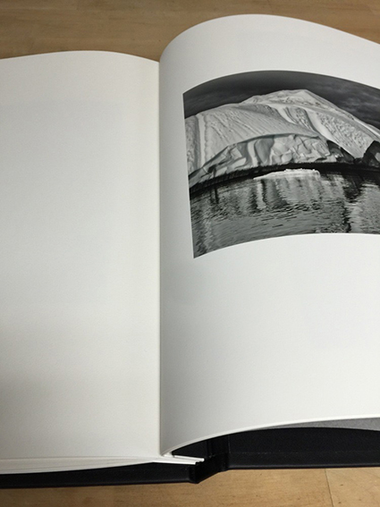
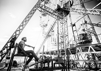
The show has forty black and white photographic prints of landscape, portraits and details of Ladakh during the Kalachakra.  These range from arid desertscapes to lush irrigated fields reflecting the mountains.  There are images from the Kalachakra as well as incongruous graffiti overlooking the capitol city, Leh.  Curious camels, luminous nightscapes and the famously painted Indian trucks balance the spiritual iconography.  A traveling circus with a lotus-decorated ferris wheel loomed above the vast desert providing an unforgettable personal and photographic experience.

“Envisioning Ecstasy” also has a conceptual aspect in the form of eleven large-scale lumenographic prints based on illustration based photographs originally sketched during the Kalachakra.  Two projected animations bring these drawings to life and complete the show. The story behind many of the documentary images was captured in Chas Curtis’ keen videograpy.  Chas’ evocative timelapses and captivating clips from ceremony to circus were seamlessly edited into a luminous video interview by Kyle Ruddick. The video is a multi-media presentation of “Envisioning Ecstasy” and will be screened at the opening. The show is accompanied by a catalog, Envisioning Ecstasy and a clothbound book, 108 Visions : Ladakh During the Kalachakra, thoughtfully designed by Michael Motley, which offers glimpses of the journey from small details to sweeping vistas.  Books and print sales benefit Tibet House US, which brings the concept of collaboration full circle. 

CCrowell_ClearLightMind_425px copy

All of this work was greatly enhanced by John Paul and Seth’s dynamic duo Art of Processing and Art of Creativity. The workshops are an intense immersive experience for honing artistic vision, voice and direction.  And of course any workshop with JP and Seth is a lesson in that all important art of playing well with others, one of my favorite photographic mantras.  Photography is often seen as a solitary pursuit and though it has it’s quiet moments, communal creativity widens the collective perspective. This golden rule underpins the entire show of “Envisioning Ecstasy.” 

“Envisioning Ecstasy” opens at Tibet House US, New York, May 20 from 6-8pm and is on exhibit until June 26. Two publications will be released for the show: a catalog, “Envisioning Ecstasy,” and a hardcover book, 108 Visions: Ladakh During the Kalachakra.  Please contact Tibet House US regarding show information and books. 

Learn more about Envisioning Ecstacy on The Leica Blog.

Find out more about Cira Crowell here.

Read more Alumni Success Stories here.

Using Color Management For Color Adjustment – Synthetic Profiles

SyntheticProfiles_425

How can you change the appearance of a digital image without changing the numbers that assign the color values? Change what those numbers mean by changing the image’s ICC profile. Using abstract or synthetic profiles, you can make massive changes to an image with little to no cost, changes that ordinarily would cause big problems using standard methods, such as posterization and noise. It’s a practice known to color geeks and few others. When you’ve got a big job to do, it can get you out of a pinch in a hurry.

In most cases, we think of using color management to accurately match colors when moving between different color spaces; ICC profiles are used to describe different color spaces and to make precise transformations to values moved from one to another to maintain consistent appearances. In very rare cases, when profiles are assigned to image files without a color conversion, the appearance of the image changes; values stay the same, but their meaning changes, so the image looks different. So when you use this unorthodox method of color adjustment, you get a change in appearance without changing the values in the file, and this is particularly useful when you want to pay a very small price for making very big changes.

Am I saying that ICC profiles are used to change values so the appearance stays the same? Yes. Am I saying that a color space is just a recipe for color, and that there are many different RGB recipes? Yes, but while they’re the standards, sRGB, ColorMatch RGB, Adobe RGB (1998) and ProPhoto RGB are just a few among many.

With just a little experimentation, you’ll find you, too, can make big changes to your images and pay a small price using synthetic profiles. Using synthetic profiles is color adjustment without editing values; they change no values, but they do change the meaning of those values—and thus their appearance. Don’t believe it? Check your histogram when you assign a profile. You won’t even see it move! It’s kind of unbelievable. Try it. See it with your own eyes. You’ll quickly become a believer, too.
Learn the steps you need to take to make your own synthetic profiles …
Read more on Digital Photo Pro.
Learn more in my digital photography and digital printing workshops.

The Epson P800 – Good Things Are Coming

EpsonP800
“Epson recently announced the highly anticipated SureColor® P800 printer, representing a new benchmark in photographic print quality. Designed for professional use, the SureColor P800 is a full 17” wide borderless printer with unique Epson® MicroPiezo® AMCTM printhead technology. Leveraging an all-new Epson UltraChrome® HD eight-color pigment ink set, the SureColor P800 is capable of producing the next generation of color and black-and-white prints that will inspire us all.”
An optional Roll Paper Adapter, for panoramic prints up to 10’ long, will be available for the P800.
Read more about the P800 here.
This news brings two milestones; black density and longevity.
Initial color tests suggest that the new printer / ink technology is capable of delivering a maximum black (dmax) exceeding 2.8 (previously 2.5). By comparison selenium toned silver gelatin is close to 2.4.
And …
Initial longevity test suggest that longevity is improved – dramatically.
“WIR Display Permanence Ratings for black and white prints made with UltraChrome HD inks using Epson’s “Advanced Black and White Print Mode” will likely exceed 400 years.” “The new UltraChrome HD pigment inks are also expected to have WIR Album and Dark Storage Permanence Ratings well in excess of 200 years.”
“With the increased Dmax, wider color gamut, and reduced metamerism provided by the new Epson UltraChrome HD pigment inks – which taken together serve to significantly enhance the visual brilliance of both color and black and white images – the increased overall permanence of the prints represents a significant contribution to photography,” said Henry Wilhelm, founder and director of research at Wilhelm Imaging Research.
Read more about the P800 permanence ratings here.
Yes! You can test the P800 in my digital printing workshops.
Learn more in my digital printing workshops.