.

Facebook Group – John Paul Caponigro Alumni


I started a Facebook Group for my workshop and seminar alumni.
If you’re one of my alumni you can use this group to …
Network – Connect and stay in touch.
Learn – Exchange information.
Promote – Grow an audience for your projects.
I use Facebook to stay in touch with people. I let them know what I’m doing. I find out what they’re doing.
My hope is that this group will be useful to you to … Read More

Coblogging Photoshop World XVII


Precons at Photoshop World XVII start today.
We’re coblogging again. Presenters will try and make one post a day of a highlight.
I haven’t even started my Epson Print Academy Precon (today from 1-5 with Rodney and Schewe) yet and I’ve had a highlight. RC Concepcion, Matt Koslowski, Corey Barker and I were discussing shooting for HDR for their demo during their Precon session. RC had scouted locations and remarked that crowds might be a problem. So I offered an idea. Shoot 3 shots for each bracketed exposure (three each for low, medium and high). First merge the moving people out. Then use the remaining three merges for the HDR merge. This stuff gets you thinking – in new ways. I love it! I’ll be do this in my workshop in Palms Springs next week. Someone will let you know how it goes. When they do you’ll find a link here.
You can see what other presenters share each day by accessing these links.
Here’s a list of everyone who coblogged last year. Check back for more links each day.
Corey Barker
John Paul Caponigro
RC Concepcion
Dave Cross
Jim Divitale
Laurie Excell
Martin Evening
Richard Harrington
Scott Kelby
Matt Koslowski
Deke McClelland
Joe McNally
John Nack
Moose Peterson
Jeff Schewe
Colin Smith
Ben Willmore
David Ziser
Find out more about Photoshop World here.
Check out the Epson Print Academy here.
Check out my Workshops series here.

Who Uses NEC?


Who else uses NEC monitors? These guys – Schewe, Holbert, and Maisel.
These guys also use NEC – Holbert, Schewe, and Maisel.
In 1989 when we started Nash Editions … there was no expectation that the screen would accurately represent how the image would translate to paper but it did provide direct control over our output.
With the release of Colorsync in 1993 color management slowly became more and more accurate. By 2000 we were working on calibrated CRT’s that provided us with a nominally accurate representation of our printed images. Finally in 2003 we acquired 2 Sony Artisan CRT’s and we experienced an unmatched level of on-screen accuracy. As the Artisans neared their end of life we realized that replacement displays would not be CRTs. Since then we have replaced all our mission critical displays with NECs. We find that they provide us with an unparalleled level of color accuracy and angle of view. – R Mac Holbert
For the Camera Raw video tutorial, I chose to use the NEC LCD2690WUXi because it had the right combination of resolution, wide screen display, wide color gamut and yet extremely accurate profiling so I could rely upon what I saw on the display. I use it day in and day out and it’s proven trustworthy… As a visual artist, everything depends upon what I see. – Jeff Schewe
I just want the rest of the process between shooting and presenting work to be accurate and simple. That is what I like about the NEC MultiSync LCD2690WUXi monitors we use at my studio. – Jay Maisel.
Find out more about what they have to say here.
Read my conversation with Will Hollingworth (Senior Manager – Product Development for NEC) here.
See the monitors in action in my workshops.

Using Color Wheels to Structure Relationships


Photographers are often not introduced to the same color theory painters are. At best, color theory is a matter of identifying complements to produce neutrality or color balance. But there are few strategies presented for conceptualizing color relationships in a photographic curriculum, while there are many for painters. In part, this is because painters could change color relationships so easily. The photographer couldn’t – until Photoshop. Now, the language and concepts of other disciplines becomes very useful to photographers. This video give you a taste.
But, be careful of one thing. Painters define complementary colors based on mixing pigments, which contain impurities. They use Red/Green, Yellow/Purple, Blue/Orange. True optical complements are found in photography (light without impurities). Use Red/Cyan, Green/Magenta, and Blue/Yellow instead. You can find confirmation of this by studying retinal after images. Stare at a color for 20 seconds. Then look to a neutral ground. The color residue you see will be the optical complement of the color you stared at.
Learn more about color in my DVDs.
Learn more about color in my workshop The Power of Color.

The Elements of Color – Color Equilibrium


Josef Albers’s Theory and Interaction of Colors is considered the definitive classic on color theory from a painter’s perspective. I actually prefer his colleague Johannes Itten’s The Elements of Color. Itten’s language is exceptionally clear. How important is language? Very! Itten does something brilliant. He avoids the whole mess of discussing color ‘harmony’, which is subjective (influenced by culture, region, individual, and time), and describes color relationships in terms of ‘equilibrium’. Complementary colors produce equilibrium; red and cyan mix to produce gray. ‘Color balance’ is produced by an equal mix of the two colors. An ideal color structure is produced by an equal mix of all colors. Equilibrium produced a perfect balance. There’s lots more where that came from. I highly recommend the book.
Find this and other books on color here.
Learn more about color in my DVDs.
Learn more about color in my workshop The Power of Color.

ICC Is A Scale


During the Epson Print Academy Andrew Rodney uses many great metaphors to explain a complex subject – color managment. Here’s one. The ICC standard is just a scale that gives numbers a context and ultimately a meaning. 1500! What’s 1500? 1500 what? Meters? Kilometers? The scale gives the number meaning and ultimately use. And using a common scale that we all share makes communication easier and more precise. Color management is ultimately all about scientifically describing and communicating color.
Catch one of the last three Epson Print Academy dates this season.
Toronto – Saturday, 3/21
Boston – Tuesday, 3/24
Vancouver – Saturday, 5/23
Learn more.
Check out the Epson Print Academy here.
Check out Andrew Rodney’s Color Management here.
Find Andrew’s book Color Management for Photographers here.
Check out my Color Management downloads here.
Check out my DVD 6 Simple Steps to Good Color Management here.
Check out my Fine Digital Print Workshops series here.

Limited Editions – Should You Limit?


Should you limit your editions? It depends. It depends on you. It depends on your level of productivity. It depends on your age. It depends on the kind of work you produce. It depends on the market you’re targeting. It depends on your representatives and how long you expect to be working with them. It depends on how quickly you’d like to see results. It depends on many things.
There’s no clear consensus or set of practices on whether and how you should limit your editions. Ultimately, it’s a personal choice. Make it an informed one. Think long and hard about it. Then act. Undecided? Wait. Keep your editions open. You can always limit later, when you develop a clear desire or identify a clear need to do so.
An edition structure is considered part of the terms of sale. Honor it. If you limit your editions, don’t widen the edition number after initial sales. You may even further limit an edition after it’s issued but while this would increase the value of previous sales it is rarely done, largely because of the complexity of accurate labeling and record keeping. You can adopt different edition structures for different images or at different points in your career; this makes describing edition structures more complex and may confuse consumers leading to loss of sales. You can always raise prices after issuing an edition; how quickly and how much is unclear as it’s determined by increasing demand for an artist’s work; but it’s hoped for by artist, dealer, and collector alike.
The bottom line is that whatever you do, do it with an eye to protecting and increasing the value of your collectors’ purchases. If you do this, the value and market for your work will increase.
There are many pros to limiting editions. It quickly escalates price. It generates broad-based interest in an artist’s entire body of work, directing attention away from top sellers to other works and to new works. It limits the amount of time spent producing the same image, directing the attention of the artist and their representatives alike to the production of new work. (More prolific artist’s benefit more from limiting their editions than less prolific ones.) It appeals to customers who will only buy art in limited editions.
There are many cons to limiting editions. It limits the audience who may appreciate an image. It prevents an artist from enjoying sales of an image at escalated prices as their career matures. (These benefits are enjoyed only on the secondary market. Though higher secondary market prices may help escalate the value of new work.) It prevents the improvement of print quality as an artist’s vision matures or as technology advances. (This can include producing prints with greater longevity or items that can hold their value for a longer time.) It restricts the artist’s ability to gift or trade their work, perhaps to a colleague or a significant collection. For better and for worse, limiting editions limits future options.
Read more in the current issue of Photoshop User magazine.
Learn more in my seminars.
Learn more in my workshops.

HDR Aesthetics

HDR imagery is expanding today’s photographic aesthetics. Identifying the characteristics of contemporary HDR images will help classicists and pioneers alike. The basic ingredients are desirable for both sensibilities, but in varying combinations and to different degrees. As with solving any problem, it’s easier if you break it down into it’s component pieces and then learn what each one does and how they interact with one another. First know what to look for. Second, know what a tool can do. Third, know how to apply a tool. Once you’ve done this, you’ll be well along the way to crafting a unique style that’s all your own.
Pronounced Shadow and Highlight Detail
Accentuated Edge Contrast
Accentuated Texture
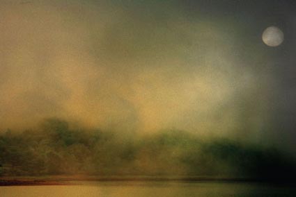
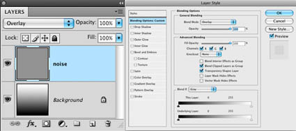
Increased Noise
Smoothed Texture
Saturation Distortions
Read more in the current issue of Digital Photo Pro.
Learn these and other techniques in my workshops.

LDR

Half HDR

HDR Simulated

HDR Simulated With Photomatix

Photoworkshop.com Photography / Imaging Contest


I’ll be co-judging this year’s Photoworkshops.com Photography and Digital Imaging Competition.
Here’s more information.
Deadline
May 1, 2009
Entry Fee
$25 for the first image, all additional images – $10 (up to 5)
Eligibility
Open to everyone 18 years of age or older except where prohibited by law.
Prizes
Over $17,000 in prizes
Selected images will appear on the covers and inside the pages of After Capture and Rangefinder magazines.
Two Categories
Straight Photography/Lightly Manipulated
Defined as generally straight photography with minimal or no graphics software enhancement.
Judged by Dr. Anthony Bannon, Director, George Eastman House.
Photo Illustration/Manipulated
Applies to images having undergone significant graphics software manipulation.
Judged by John Paul Caponigro, fine artist.
View the Complete List of Awards and Competition Rules here.

Ansel Adams Interviewed By Roy Firestone

Few photographers, if any, were as influential to the development of the medium as Ansel Adams. Ansel Adams saw the digital revolution coming. Based on his writings, it’s certain he would have embraced many of the changes. But which ones? What would his working methods be like? What would it be like if he were still with us? Always interesting questions to consider.