.

John Loiacono Discusses the Future of Photoshop

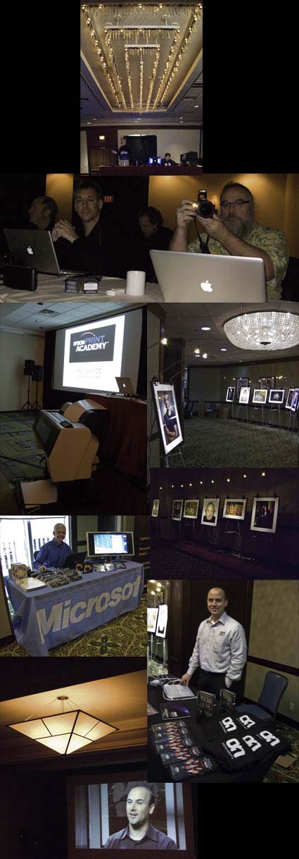
Known for his engaging personality, “Johnny L” (senior vice president of Adobe’s Creative Solutions Business Unit) discusses his thoughts on the future of imaging and how Photoshop plays a part of that. He gets it. He really gets it. And he’s got an inside track on future imaging technology. Among the many key ideas he addresses is what I consider to be an extremely important issue, enriching the experience of engaging high density information (beginning of video 2). Check out these videos for a glimpse into the future and one of the minds helping guide us there.
And check back here tomorrow for news on an important announcement from Adobe tomorrow.
Are you ready for something brilliant?


JPC on thirdeyephotozine.com


Recently Rayhaan Traboulay interviewed me for his online magazine thirdeyephotozine. Here’s an excerpt.
RH I recently had a discussion with a friend about creativity within people. I
find that people either generally “have it” or don’t. I believe that you
can’t really teach it too much. Theres room for improvement and critiques
and so on, but I find it is either innate in someone or it’s not. Would you
agree or no?
JPC I disagree – strongly. To be a successful creative person in any field, it
takes perseverance, intelligence, hard work, skill, talent, and luck – in
that order. Everyone is creative. Different people have different creative
strengths. It helps to find the areas each of us are strongest in and to
develop skills within other areas to become more versatile. Creativity is
not contained to the arts. Some of the most creative people in history and
with us on the planet today work in the fields of science and business. We
all have something to offer. And something to learn from each other.
Do you think you can learn to be more creative? Comment here!
Read the rest of the interview here.
Read more interviews here.
Read and hear my comments on my images here.
Find free PDFs on making artist’s statements here.
Hear my free tips on becoming more creative here.
See my images and get free portable galleries here.

Certificates of Authenticity


How do you reduce forgery? One way is to issue certificates of authenticity. The artist issues a certificate of authenticity with the artwork. There are many ways to handle this. The artist can give the certificate to the client. The artist can keep the certificate on file for clients. Or, the artist can give one to a client and keep a duplicate. Ultimately a certificate can be forged. But holographic seals can’t. The Hahnemühle Certificate of Authenticity (certificates and holographic seals) was designed to help reduce the risk of forgery.
There are many steps you can take to reduce forgery.
1 Share digital files only with trusted sources and post low resolution files to the web
2 Insert copyright information in the file (as a layer, in the file info fields, in metadata).
3 Sign and number all prints(even if issued in an open/unlimited edition). Sign only saleable prints.
4 Keep good records of sales.
5 Note provenance (production history) on the back side of prints.
6 Use certificates and seals.
What other steps do you/could you take to ensure authenticity? Comment here!
Learn this and other tips and techniques in my Fine Digital Print workshops series.

Printing – Finding the Coated Side of the Paper


Finding the side of a paper that’s optimized for printing can sometimes be challenging. Here are a few tips to help.
1 Look for the logo – the logo is always on the back.
2 Compare whites – the coated side is often whiter.
3 Feel the surface – the coated side is smoother.
4 Lick the paper – the coated side sticks more.
5 Feel the edge – paper is cut coated side up leaving a tiny lip/edge on the back side.
If you have other tips for finding the coated side of paper, comment here!
Learn this and other tips and techniques in my Fine Digital Print workshops series.

William Neill – Impressions of Light Digital Book


World reknowned landscape photographer William Neill recently released his new digital book Impressions of Light containing all new work with a twist. “Throughout my career, I have been seeking to inspire passion for the natural world and convey my emotional response to the subjects I photograph – that of awe and wonder. In 2005, when I learned a new way for me to convey such an emotional response by the use of camera movement during exposure, I began creating a new body of work entitled Impressions of Light. Inspired by color photographers Ernst Haas and Freeman Patterson, and of course the great Impressionistic painters, this work is simply another way. See how experimentation reinvigorates a contemporary master’s process in this new work.
Containing 100 pages with 69 photographs, Impressions of Light is available as a downloadable PDF only. A special introductory price of $15.00 USD is available until October 1 – thereafter $19.95.
Read more about and see more of William Neill’s Impressions of Light digital book here.

The Art of Arranging


Proximity and sequencing matter. The first sequence suggests an approaching storm, while the second suggests clearing skies.
How you present your work may be almost as important as what work you present. It’s the art of arranging. And it is an art, which involves specific techniques that can be learned. What are some of the guiding principles involved? Here are a few.
Sequence matters. Start strong. Finish strong. Make getting there interesting. Whether it’s a symphony, a novel, or an exhibit. It’s good advice for arranging any creative product.
To sequence a project, you can use the metaphor of building a fence. The strongest pieces can be thought of as posts. The less strong pieces can be thought of as rails. You want to start and end with very strongest pieces to create a strong structure. You want to periodically reinforce runs of less strong units with one or more stronger units. You don’t want long runs of rails without posts or the structure may fail. A fence made only of posts becomes something else entirely, a wall with no variation or grace. The number of strong pieces you include determines how long a fence will be, though the number of other images you include may modify length somewhat …
What tips do you have for sequencing? How have you used this potential for your work? Comment here!
Check out the rest of this article in my column Illuminating Creativity in this month’s AfterCapture magazine.
Check out AfterCapture.com here.
Find 6 related PDFs here.
Learn these and other techniques in my Fine Digital Print Expert workshop here.

Printing – Humidity


Extreme humidity can impact print quality. This is particularly true for but not exclusive to matte papers, which are more absorbent.
We printed for my Annual Exhibit in high humidity. The paper had absorbed a lot of moisture and so there was substantially more dot gain. The prints were coming out substantially darker and we were having trouble maintaining shadow detail. It’s made me want to store all of my paper in a climate controlled environment (using a dehumidifier or air conditioner). Or, climate control my entire studio. Rather than reprofiling for an atmospheric condition that changes unpredictably, we compensated with proofing. We lightened the files selectively before printing. With a little testing, we came up with standard adjustments that could be used on multiple images, with customized shadow masks for individual compositions. It pays to think about the impact of humidity on your printing. Control humidity when you can. Compensate for it when you can’t. You get better prints.
What do you do to compensate for excessive dot gain due to environment or overinking? Comment here.
Check out my Printing downloads here.
Check out my DVD The Art of Proofing here.

Find out about my The Fine Digital Print Workshop Series here.

Printing – Proofing


Proofing is an essential part of making the finest prints possible.
While color management and softproofing get you 90% of the way there, there are all kinds of things you still need to check in hardcopy – materials, ink limit, sharpening to name a few. Every time I print an image, I create a BAT (a final proof) that I archive for future reference. The next time I print the same image the BAT tells me how I got the best results the last time it was printed. That then becomes a starting point for future improvements. Combine advancing technology (printers, ink, substrates) and good color management / proofing practices and you’ll find your print quality will constantly evolve.
Do you proof? What kinds of things do you routinely proof?
Check out my DVD 6 Simple Steps to Good Color Management here.
Check out my DVD The Art of Proofing here.
Check out my Proofing downloads here.
Find out about my digital printing workshop series The Fine Digital Print here.

Photography.Book.Now Winners Announced


Congratulations to the winners of Blurb’s Photography.Book.Now contest.
The winning photographers and their books are …
– Grand Prize:                            Beth Dow, In The Garden
– Category Winner, Themed:       Jonathan Smith, The Bridge Project
– Category Winner, General:       Talia Chetrit, Reading
– First Runner-up, Themed:        Cara Phillips, Singular Beauty
– First Runner-up, General:         John Lehr, Something is Happening
– Second Runner-up, Themed:    Panar, Johnstown / Lowy, Iraq Perspectives (tie)
– Second Runner-up, General:     Michael Corridore, Roadworks
Which Blurb books you enjoy most? Comment here!
Find out about the contest here.
Check out all the winners and the honorable mention and preview their books online.
Check out my Blurb book Antarctica here.

Printing – Glass / No Glass


It can be helpful to see what presentation behind glass / plexiglass will do to print quality. The appearance of prints can shift slightly; darker and/or towards blue or green.
You can preview this before framing by keeping a sheet of glass/plexi-glass in your printing area and looking at final proofs and finished prints under glass / plexiglass to see the impact it will have on print quality. On occasion you may want to make small adjustments to a final print based on what you see. But remember, glass is often replaced. If you compensate for glass and the glass is replaced, make sure the new glass matches the old glass.
What kind of glass do you use for presentation? Do you use it? Comment here!
Check out my Printing downloads here.
Check out my DVD The Art of Proofing here.

Find out about my The Fine Digital Print Workshop Series here.