Halos & Lines In Your Photographs – How To Avoid Or Quickly Fix Them
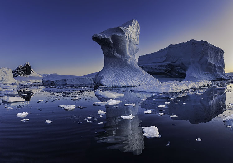
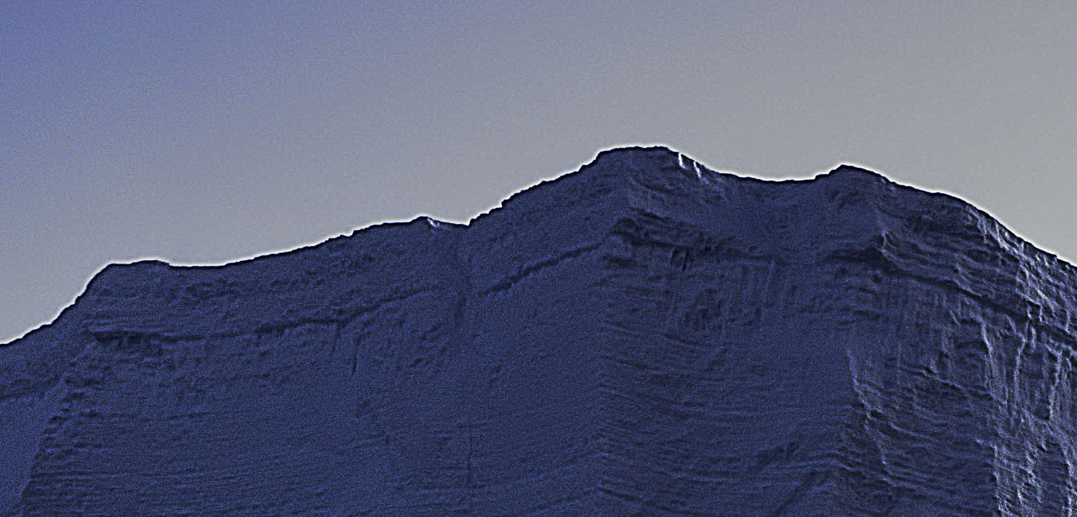
halo and line on horizon
Nothing screams digital artifacts more than halos and lines. Bright and dark lines around the edges of objects make straight photographs look altered, and altered photographs look poorly crafted. Rarely, if ever, a good thing, their insensitivity to both contours and textures within images is supremely distracting. It's easy to eliminate these dealbreakers if you know what to look for, how to avoid them, and, when necessary, eradicate them.
Know What To Look For
First, know what to look for. If halos and lines exist, you'll find them along the edges of shapes and, sometimes, the spaces objects surround. They're most pronounced when the inside and the outside exhibit more contrast. Halos, the bright lines, are obvious; the brighter, thicker, harder halos are the more obvious, while darker, thinner, softer halos are less obvious. Lines, the dark lines, are less obvious. As they get darker, thicker, and harder, they become more obvious.
Know How To Look For It
Halos are harder to spot in higher-resolution images that must be zoomed in (100% screen magnification) to be seen accurately. The worst is seeing them after an image is printed on a large scale. This time-consuming and expensive mistake can easily be avoided by looking closely at images before processing is finished.
Don't Produce Them
Second, know how they're produced. The quickest way to produce halos and lines is with digital sharpening, whether that's the Detail panel in Lightroom or Camera Raw, filters in Photoshop like Unsharp Mask and High Pass, or third-party plug-ins like Nik. The point here is not to avoid these tools but rather to apply them in ways that don't or minimally produce these artifacts. The next quickest way is to use any contrast tool that accentuates them; sliders in the Light panel, Curves, Texture, Clarity, and Dehaze should be monitored too. These tools won't produce halos, and if you don't have halos and lines, these tools won't accentuate them. (Careful, at high settings, Clarity and Dehaze may produce very thick, feathered halos and lines, and when they've gone too far, these artifacts look more like sloppy masking than over-sharpening. These are much harder to fix than hard lines around contours, so try not to produce them.)
See my articles on High Pass, Clarity, and Dehaze for more.
If any tool produces halos while you're processing, reduce the settings until they don't (Remember to zoom in to check this before moving on.) It's easier not to produce them than to cure them. If you discover halos and lines long after they were produced, find the slider or layer that produced them and change those settings. (In Photoshop, it's critical to adopt a flexible workflow using smart filters, adjustment layers, and layers so that you can do this quickly and easily. If you start building too many effects into flattened layers, you'll have to redo the whole thing.)
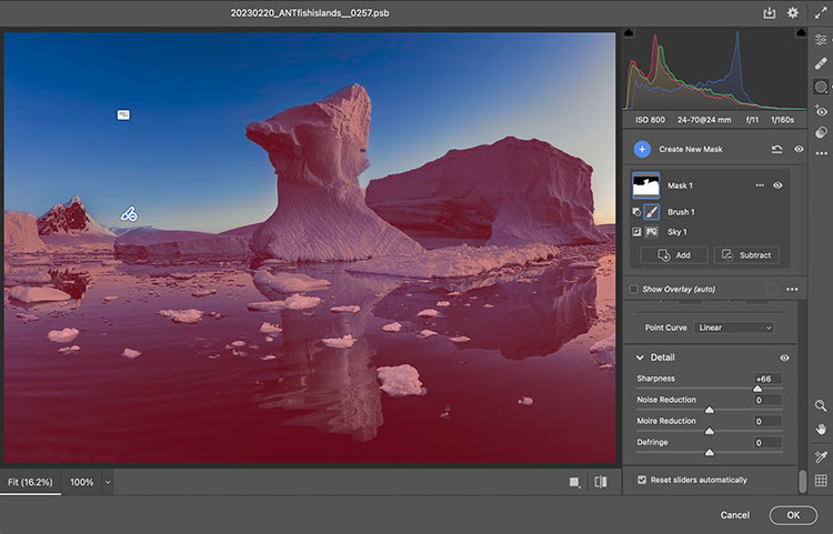
adjustment in Camera Raw masked
Mask Them
Sometimes, the artifacts produced by sharpening and contrast enhance images positively inside contours, but along contours, they look terrible. Consider applying the effect and masking it away from the contours in this case. Horizon lines are one of the most important image elements to monitor. This contour typically has more contrast than any other, not only in luminosity but also in texture, which means halos are more easily seen in the lighter, smoother sky.