Goodbye Photoshop? This Hidden Button in Lightroom Changes Everything!”
.
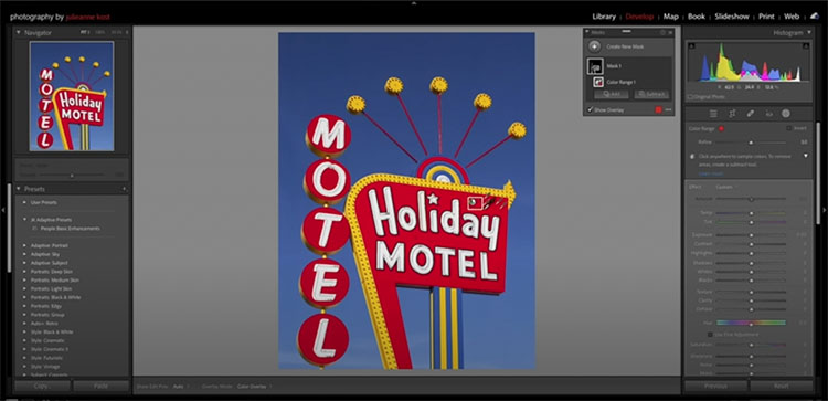
“The new Masking Section added into Lightroom was a BIG DEAL! But…did you know there’s a Hidden Button that makes it EVEN BETTER by giving way more control? In this video, I show how we can use this hidden function to realistically add drama to skies, add Special Effects, light a Macro Shot AND add Highlights to a Portrait!”
00:00 – Introduction
00:34 – What is Intersect?
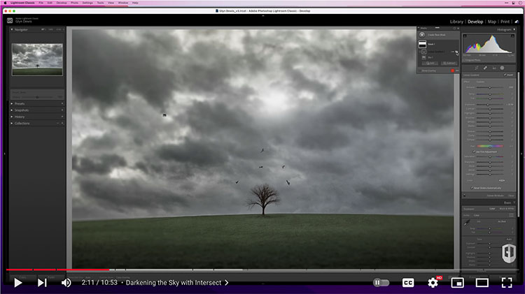
01:03 – Darkening the Sky with Intersect
02:19 – What does Intersect do?
02:31 – Adding Drama to the Sky
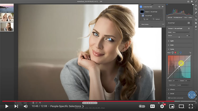
03:57 – Intersect and a Portrait
04:23 – Adding Street Lighting with Photoshop
05:06 – Adding Street Lighting with Lightroom
06:22 – Lighting Macro with Intersect
07:31 – Adding Side Lighting / Highlights
07:48 – Highlights with a Layer Style in Photoshop
09:06 – Highlights with Intersect
10:08 – Lightroom Virtual Summit 2022
View more from Glynn Dewis here.
Learn more in my digital photography and digital printing workshops.