.

New Exhibit – The Spell of the Sensuous : John Paul Caponigro & Joyce Tenneson

01_Tenneson_425 Illumination XXXV

.

Opening & Artists Talk

July 25th

Artist Talk 3 PM
Opening Reception 6-8 pm

RSVP Here

Location

YJ Contemporary Fine Art Gallery
42 Ladd St. STE 107
East Greenwich, RI 02818

Get More Information Here

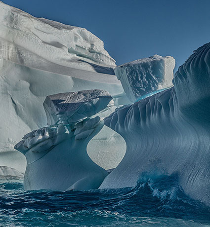
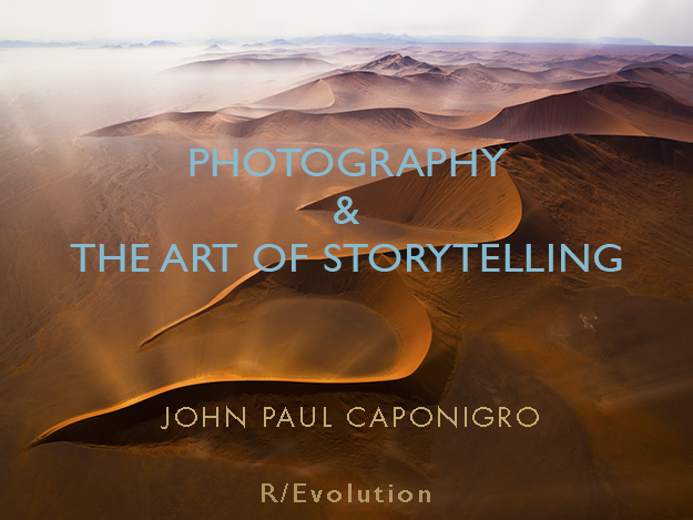
The Spell of the Sensuous: The Fluid Nature of Perception, featuring the photography of John Paul Caponigro and Joyce Tenneson, opens at YJ Contemporary Fine Art on Thursday, July 25th.  The exhibition celebrates the works of two of the nation’s foremost photographers known for their ability to create images that are poetic, evocative and mystical.   The exhibition will present iconic examples of Joyce Tenneson’s portfolio of work- including images from her figurative portraiture series, her “Intimacy” series, and images featured in her 2012 book “Trees and the Alchemy of Light”– alongside works by fine art environmental photographer John Paul Caponigro – including images from his Alignment, Exhalation, and Illumination series. A review of the exhibition is featured in the July/August issue of Art New England magazine.
The artists will give a gallery talk on Thursday, July 25th at 3pm to discuss their creative process and photographic style.  The talk is free and open to the public but requires advance registration. (Register here)  An opening reception will follow from 6-8pm that evening.
The exhibition at YJ Contemporary Fine Art runs through September 5th.

Get More Information Here

How Trees Talk To Each Other | Suzanne Simard


“A forest is much more than what you see… Underground there is this other world — a world of infinite biological pathways that connect trees and allow them to communicate and allow the forest to behave as though it’s a single organism. It might remind you of a sort of intelligence.” says ecologist Suzanne Simard. Her 30 years of research in Canadian forests have led to an astounding discovery — trees talk, often and over vast distances. Learn more about the harmonious yet complicated social lives of trees and prepare to see the natural world with new eyes.
Find more great resources on trees at Brain Pickings.
Read about the must-read book The Hidden Life Of Trees.

How To Preserve Lively Shadows In Your Prints

Constellation_XXVI_Shadows
One of the keys to making a great print is great shadow detail.

Shadow detail is something to be mindful of during exposure, processing, and printing. Curiously, even if you see shadow detail in your file on a calibrated monitor you may not see all of the details in your print. What can you do about this? Many things!

First Check Your Color Management
Before you start editing your files based on your proofs, check your color management system.

Recalibrate Your Monitor
Make sure you’ve calibrated your monitor with hardware. Set a brightness value of 90-100 lux, instead of using the default brightness target of 120 lux. If your monitor is too bright, your prints will look dark overall, especially in your shadows.

Read more on Profiling Your Monitor here.

Give Your Prints Enough Time To Dry
Inkjet prints come out of the printer almost dry, but not quite fully dry. When they’re fully dry, they’ll appear slightly lighter, especially in the shadows where there’s a lot of ink. So before you evaluate prints critically, give them a few minutes to dry. This affects absorbent matte surfaces even more than glossy surfaces.

Find my resource on Outgassing here.

Look At Your Prints In Good Light
Look at your prints in good light. You need the right amount of light (at least 500 lumens), the right color temperature light (5000K is the standard but many viewers prefer the warmer 3600K), and it helps to use full-spectrum light (a CRI of 90 or higher). (Many manufacturers now make full spectrum bulbs, like Solux and Soraa.)

Read more on Controlling Your Environment here.

MediaType_P800

Media Type sets the amount of ink that's used.

Set Your Media Type Correctly
Your printer driver will allow you to set your media type, which controls ink the amount of ink that is sprayed on your paper. Use too much ink and you’ll lose shadow detail. Use too little and your blacks and midtones will appear weak. If you’re using a paper not made by the manufacturer, choose the nearest media type and then adjust its settings with the printer driver’s advanced utilities. (You’ll find this under Advanced Media Control with Epson printers.)

Find my resource on Ink Limit here.

testfile_shadows

Print test patches to determine when maximum black is achieved and when separation is lost.

Print A Target To Determine How Much To Lighten Shadows
Before you adjust your files for printing precisely determine how much you need to lighten your deep shadows by printing a target. While they vary a little, most media settings lose shadow detail around a value of 96% on a grayscale. If you print patches of values between 100% and 90% you’ll see exactly where you lose shadow detail. Printed results will vary slightly with each different media setting, so you’ll need to adjust files slightly differently for different media.

You can download my targets here.

Next Adjust Your File


Insights Members can login to read the full article.
Email:
or Sign up

Top Photographers Celebrate The Power Of The Print


John Paul Caponigro

Jeremy Cowart

Gregory Crewdson

Lois Greenfield

Steve McCurry

Gerd Ludwig

Mark Seliger

John Sexton

Tim Tadder

Amy Toensing

Steven Wilkes
Top photographers celebrate printing and talk about what drew them to photography, the inspiration that drives their work, the stories behind their most famous images.
Learn more in my digital photography and digital printing workshops.
Read more with my online Printing Resources.
View more with my Printing DVD.

The Caponigros – Two Generations Of Photographers

.

In this video my father and I share insights into our creative lives and our passion for printing.

View photographs here.

Find quotes here.

Read Q&A here.

Find conversations here.

Learn more in my digital printing workshops.

How Does Lightroom’s New Texture Slider Compare To Clarity and Sharpness ?

01_Dehaze_Maximum

Maximum Dehaze

02_Clarity_Maximum

Maximum Clarity

03_Texture_Maximum

Maximum Texture

04_Sharpening_Maximum

Maximum Sharpening

05_Texture_Negative

Negative Texture

06_Clarity_Negative

Negative Clarity

Think of Adobe Lightroom Classic and Camera Raw’s new Texture slider as producing an effect that lies somewhere between the Clarity and Sharpness sliders.

It’s closer to Sharpness so when you apply it, rather than looking at the full image, zoom in to 100% to evaluate the detail accentuation it produces. So, use it more for detail enhancement than contrast.


Insights Members can login to read the full article.
Email:
or Sign up

What In The World Is Color Psychology ?

Flypaper Textures Autumn Painterly Collection Texture for artwork and photography from Flypaper Textures
Color psychology is the study of how color affects human behavior. It’s a long-standing, field used in art, design, marketing, sports, medicine, and much more.

Despite its long history and widespread use, there’s a lot more to discover about how color affects people scientifically. Here’s are a few facts that have been scientifically proven.

We see certain colors more quickly than others.

Warm colors are stimulating and cool colors are calming.

A red room feels 10 degrees warmer, while a blue room feels 10 degrees cooler.

Colors can enhance the effectiveness of placebos.

The presence of green speeds healing.

Athletes perform better in certain colors and get penalized more in others.

Clearly, the responses to color are at once physical, psychological, and social, so identifying the strongest contributor(s) to a response(s) is no easy matter. The more social the response, the more likely it is to vary between individuals. Socially, color psychology has many layers – universal, cultural, regional, communal, individual. And then there’s time. Age (as well as gender) can also influence how a person perceives and interacts with color. An era or a moment can become important factors too. It’s complicated but it’s fascinating!
Color affects body, mind, and emotions. Color can be used by physicians to promote physical and psychological health, by businesses to brand identities and influence purchasing decisions, by political movements to propagate values and ideas, and by artists to communicate aesthetics and emotions. Color is a powerful communication tool that can be used to influence perception, mood, and action.

Considering the psychological dimensions of color consciously will give you a greater awareness of the phenomenon of color and improve your ability to communicate with it. Remember, there are shared responses to color and you have your own individual responses to color. Being able to tell the difference can be insightful. This mindfulness is something every visual artist will benefit from.
How will you use color?

Read more on Color Psychology here.
Learn more in my digital printing and digital photography workshops.

All The Symbols The Rainbow Contains

Flypaper Textues. Texture overlay for photography and artwork, Flypaper Tex Box 2

What’s the first thing that comes to mind when you see color? Chances are you’re not alone. Color associations come from many sources universal, cultural, regional, communal, and individual. These all change over time, with changes happening faster at the individual level than the global level.


It’s useful to understand what associations accompany colors for a majority of people. This understanding can be used to influence perception, clarify statements, reinforce messages, produce physical responses, and elicit emotional reactions.

It’s also useful to understand what associations accompany colors for yourself. This understanding can become the basis for a personal palette that gives your images a unique style. It will clarify and deepen your personal journey.


You’ll find classic associations with the colors of the rainbow and more here. You’ll discover classic images connected with color, verbal expressions related to the color, and synonyms or the many words used to describe colors in the same family.


Red

Blue

Yellow

Orange

Green

Indigo

Violet

Brown

White

Gray

Black


Read more on Color Psychology here.

Learn more in my digital printing and digital photography workshops.