Lightroom and Photoshop offer an impressive array of tools for adjusting an image’s contrast. At some point luminosity contrast adjustment tips over to affecting image detail (contour and texture) more than overall lightness. Deciding exactly how you want to affect lightness, contour, and texture is the key to deciding which tool to use and how to use it.
The following progression moves from the smoothest to edgiest tools – Curves, Clarity, Dehaze, High Pass, and Sharpening. The differences between these tools can be found in the way they handle frequencies of detail; low or smooth, medium or broad lines and moderate texture, and high fine lines and grain.
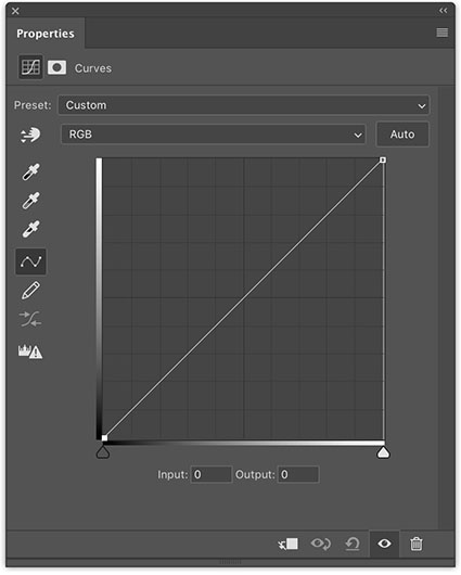
Curves
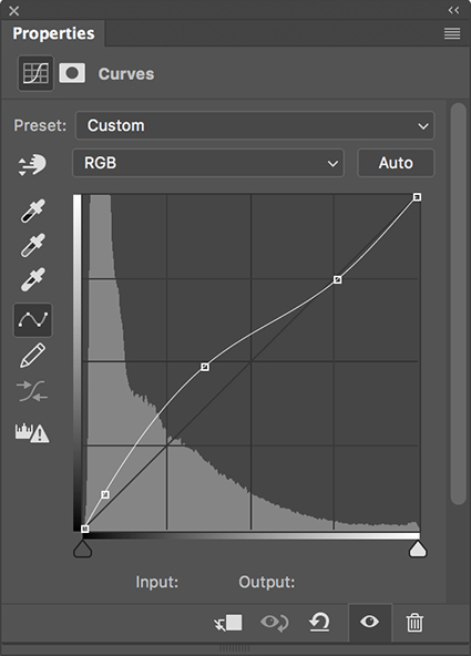
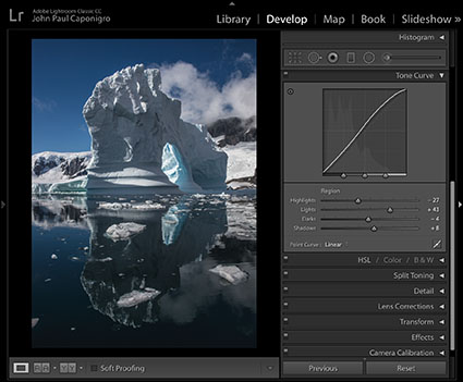
Curves creates the smoothest effects. It simply affects light and dark values. With it, you can fine tune the relationships between different values with unparalleled precision. Curves ignores texture and contours. If either is affected it’s simply because those areas are lighter or darker, not because they have been targeted. Along with contrast, Curves also boosts saturation somewhat. (If Curves is applied in Photoshop, this saturation shift can be removed by using a blend mode of Luminosity.)
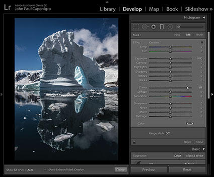
Clarity
Clarity offers the second smoothest effects. It pays significant attention to contours. The contrast it adds to contours is smoothed or broadly feathered. Think of it as a local vignetting, not for the frame, but for areas within contours. To make the effect more realistic, it darkens the dark side of contours more than it lightens the light side of contours edges, greatly reducing visible bright halos. Clarity makes images look clearer for two reasons; one, because the overall contrast appears to remove haze; and two, because the edge contrast makes images appear better focused or sharper. Clarity, particularly strong applications of it, will accentuate texture affecting medium frequency detail even more than high-frequency detail. Strong applications of Clarity will boost saturation significantly, which can be removed with the Saturation slider. Clarity does not exist in the Photoshop Image > Adjustments menu but can be applied in Photoshop with the Camera Raw filter.
Dehaze
Dehaze offers the third smoothest effects. It creates effects that are similar to Clarity, only stronger. Dehaze darkens shadows and rather than brightening the highlights it simply pulls out more separation by darkening the lower values in these areas. Strong applications of Dehaze may even reveal detail you can’t see with the naked eye. Dehaze affects larger areas of contrast, sometimes losing the ability to distinguish between smaller areas. While Clarity boosts saturation somewhat, Dehaze boosts it more and often creates color non-uniform shifts. (There is a cure for this, which I cover in a separate article.) Dehaze does not exist in the Photoshop Image > Adjustments menu but can be applied in Photoshop with the Camera Raw filter.
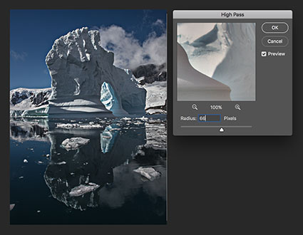
High Pass High
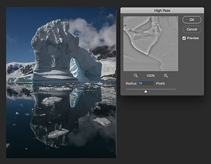
High Pass Low
High Pass filtration drives contrast into edges. It produces significantly different effects at low and high settings. At low settings it affects contours most, only slightly affecting texture and having little or no effect on overall contrast. At high settings it produces localized vignetting similar to Clarity but with less feathering, making it an excellent tool for emphasizing planar contrast. Be careful, it does not have the halo suppression built into Clarity. Only high settings create saturation shifts, which are localized not uniform. Remove this by desaturating the layer you apply the filter to. The High Pass filter is only available in Photoshop and is usually applied on a duplicate layer set to a blend mode of Overlay.
Texture
The Texture slider produces effects that lie between the Clarity and Sharpness sliders.
When compared to Clarity, the Texture slider does not increase saturation and it produces an effect significantly more targeted to edges. With little or no localized vignetting, it has less effect on overall contrast (Think of it as a micro-contrast.) and will not produce planar or volumetric accentuation. While it does produce more of an overall contrast effect than Sharpness, Texture is much more suited to detail enhancement. Think of it as a broader softer Sharpness rather than a finer edgier Clarity.
When compared to the Sharpness slider, the edge it produces is not as pronounced (It’s more feathered.) nor does it increase artifacts or noise as much. Texture increases or decreases apparent sharpness in mid-frequency detail. Its effects on smooth (low frequency) and fine (high frequency) detail are minimal. Think of it as producing an entirely different mask that removes effects from low and high-frequency detail rather than the one produced by Sharpening’s Masking slider that removes effects first from smooth areas and then gradually converges on edges at higher settings.
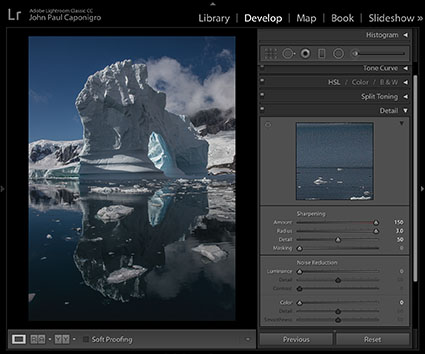
Sharpening
The Detail Panel’s Sharpening sliders aggressively target edges. It offers four sliders – Amount, Radius, Detail, and Masking. Amount determines the increase in contrast. Radius accentuates contours in thinner (lower setting) or thicker (high setting) areas. Detail targets the effects of the previous two sliders into lower (less texture) or higher (more texture) frequencies of detail. Masking creates a mask that removes the effects of the other sliders from smooth areas at low settings and from all areas but contours at its highest settings. These sliders produce no overall contrast effects and little to no saturation shifts. (These detail sliders don’t exist in the Photoshop Image > Adjustments menu. Photoshop’s filter Unsharp Mask offers identical Amount and Radius sliders but it lacks the Detail and Masking sliders. Instead, it offers a Threshold slider that allows you to remove the effect from adjacent areas that have less contrast than the Threshold you set.) These tools are the ultimate tools for accentuating texture and contour.
Experiment. Develop your eye for all of the possibilities these tools open up for you. You’ll be amazed by what they can do. And when you master them, your viewers will be amazed at how good your images look.
Read more on Color Adjustment here.
Learn more in my digital printing and digital photography workshops.
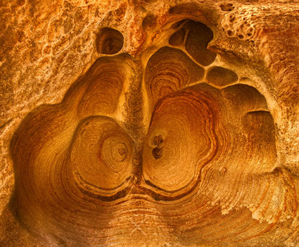
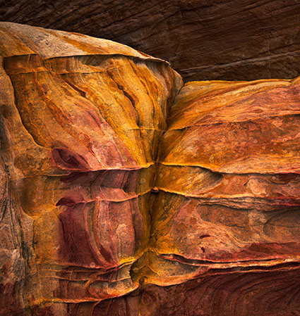
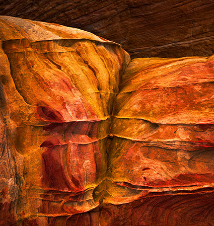
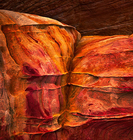
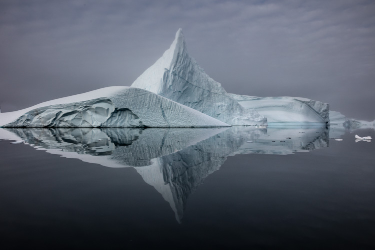
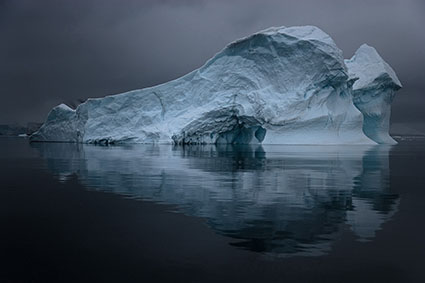
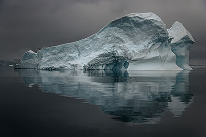
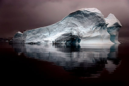
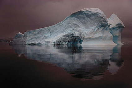
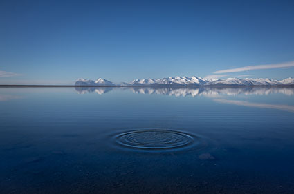
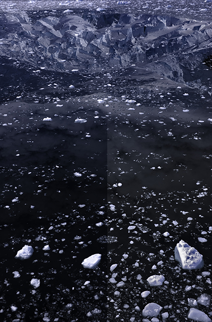
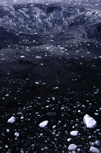
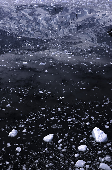
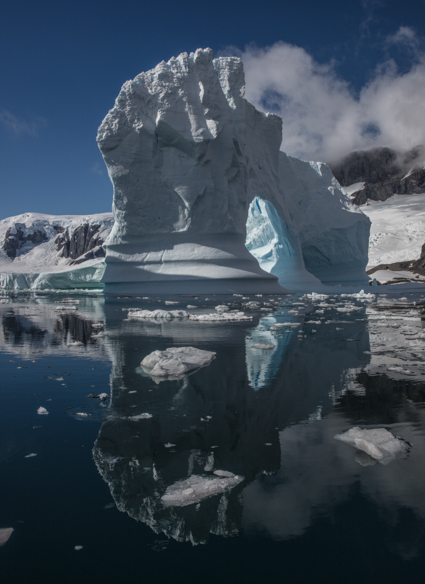
View test files with maximum applications of these tools below.
Read More