Why You Should Proof Print Detail at Full Size
Sharpness, noise, and edge quality can be precisely evaluated only in a full-scale proof.
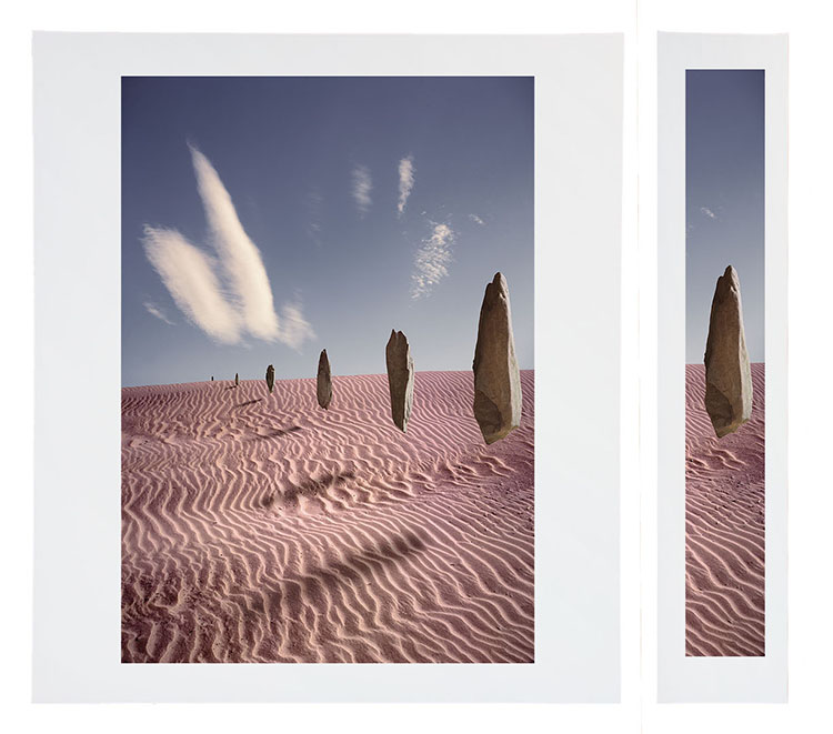
A full-scale slice will increase proofing efficiency and economy.
Noise, sharpness, and edge quality can be precisely evaluated only in a full-scale proof.
A full-scale slice will increase proofing efficiency and economy.
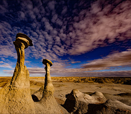
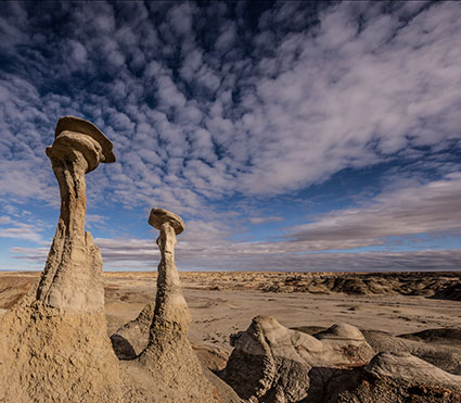
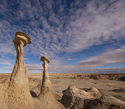
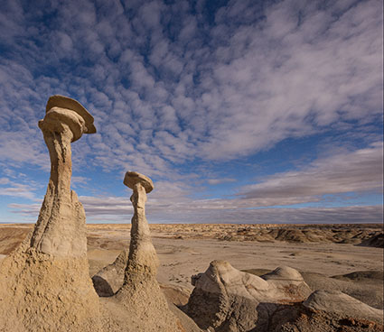
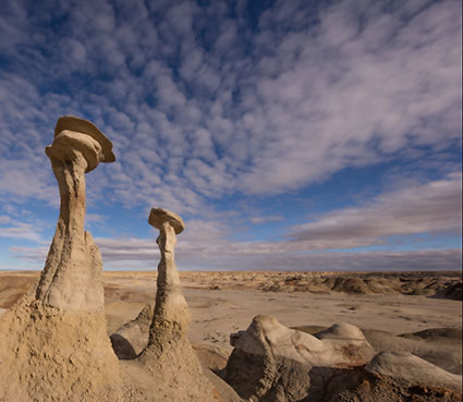
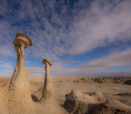
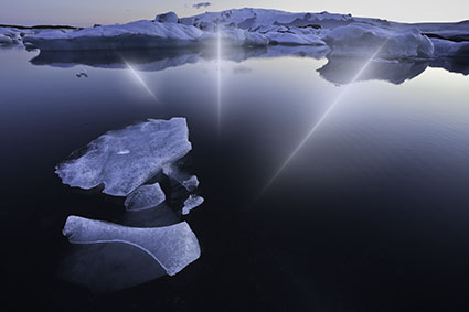
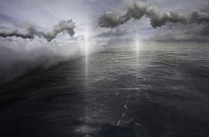
To see it accurately, while color can be proofed at reduced scale, detail in prints needs to be proofed at full scale. That doesn’t mean you have to proof the full image. You can save time and materials by printing a cropped version. Select areas of an image that contain the widest variety of textures, particularly sections that show the information you’re most concerned with. Check three things – noise (smooth areas), sharpness (textured areas), and edges (contours).
Output sharpening is something that needs to be proofed to be seen. Because of mismatched resolutions (images on 72 dpi monitors appear much larger than they do on 1440 dpi printers) and variances in substrates (matte and glossy surfaces differ substantially in their ability to reproduce detail), the image on screen can only approximate final print sharpness. Proof images to view sharpness precisely.
If you’re using Lightroom, once you get a sense of the three settings – Low, Standard, and High – you can choose one based on the image content. (I very rarely use High; too crunchy. I choose Standard for textured content and Low for smooth subjects. For very smooth images with little to no texture, I uncheck Output Sharpening.
There’s another reason to proof at full scale that’s perhaps even more important. Our experience of images can be profoundly changed by size.
Explore more Printing resources here.
Learn more in my digital photography and digital printing workshops.