Great Quotes On Photographic Prints
Enjoy this collection of quotes on photographic Prints.
“We should always remember that the practice of printing – of using an object to control the form of a repeated picture – has had a role in human culture from its earliest days.” – Richard Benson
“Fine art prints created by the artist, or the artist’s collaborator, are important because they best represent the artist’s vision. Images displayed on digital devices are subject to the non-uniform nature of different displays and they may appear radically different than the artist intended.” – Mac Holbert
“My ideal is to achieve the ability to produce numberless prints from each negative, prints all significantly alive, yet indistinguishably alike, and to be able to circulate them at a price not higher than that of a popular magazine or even a daily paper. To gain that ability, there has been no choice but to follow the road I have chosen.” – Alfred Stieglitz
“Regarding rumors that the digital age is soon to render photographic prints as being no longer necessary or relevant (due to increasing numbers of photographic images being viewed on electronic monitors), speculators overlook the tremendous importance and historic relevance of the physical artifact as being a uniquely necessary and applicable aspect of photographic art. The electronic image could no more replace a fine photographic print than a synthesizer could replace a violin!” —Huntington Witherill
“When you make a print, you are making an art object. You can’t hang a scan on the wall.”- George Tice
“The print is an idea made visible. For my process, a photograph isn’t a photograph until it’s a print. I love the physical presence of a print from beginning to end. For me it’s a tactile, sensual experience. I want it to be an object of beauty, whether the subject moves you or not.” – Tillman Crane
“A photograph doesn’t feel real until it is a tangible physical object I can hold in my hand.” – Stephen Johnson
“A beautiful print is a thing in itself, not just a halfway house on the way to the page.” – Irving Penn
“A picture is worth a thousand words; A fine art print so much more.” – Steve Denby
“Mostly, I worked so quickly, I didn’t see the details of a photograph until it was printed.” – Harold Feinstein
“I was a very, very careful printer when I used 8-by-10 film. I probably spent more time on printing than anything else. The more the prints were appreciated, the more time I spent on them.” – Ruth Bernhard
“I think that it is a sensual pleasure – image making. It’s not just the finished print, which is sensual in terms of the tactile qualities of the materials that I use. I’m seduced by the light, all the time.” – Elizabeth Opalenik
“You will often see that it is the unexpected accident, in tandem with your practice, that will transform the science to art.” – Christopher James
“I like to think one of art’s greatest techniques is creative stumbling, where missteps lead to creative encounters. Digital printing is an adequate place to falter — the wet darkroom is a veritable minefield of happy stumbling opportunities.” – Dan Burkholder
“For me the printing process is part of the magic of photography. It’s that magic that can be exciting, disappointing, rewarding, and frustrating all in the same few moments in the darkroom.” – John Sexton
“To convey in the print the feeling you experienced when you exposed your film – to walk out of the darkroom and say: ‘This is it, the equivalent of what I saw and felt!’. That’s what it’s all about.” – John Sexton
“The negative is the equivalent of the composer’s score, and the print the performance.” – Ansel Adams
“In my mind’s eye, I visualize how a particular… sight and feeling will appear on a print. If it excites me, there is a good chance it will make a good photograph. It is an intuitive sense, an ability that comes from a lot of practice.” – Ansel Adams
“Some of my photographs have always been a mystery to me in terms of how I arrived at them. Even with the technical ability to produce fine prints, I am hard put to know how it happens, yet unless technique and materials are seriously investigated and experienced, I see that moving statements are seldom made.” – Paul Caponigro
“All that I have achieved are these dreams locked in silver.” – Paul Caponigro
“When you make prints you deepen your relationship with your images.” – John Paul Caponigro
“It’s the last 5% in quality that separates the good prints from the great prints.” – John Paul Caponigro
“We used to have to make prints in order to view certain images, particularly black and white ones. Now you don’t. But for many of us, prints are still very much desired – I think they always will be. Physical prints do many things that no other method of presentation does. With a print, you experience an image in combination with specific materials, which enhance expression. You experience a print at specific scales, which has an impact on how an image is viewed and, in many cases, modifies the message the image conveys. Prints offer non-powered portability; they can be retrieved and distributed at a moment’s notice to anyone without the need for other supporting devices or additional communication. Prints can be displayed in ways that make an image’s presence more durable, affecting and even shaping the environments they inhabit; with sustained viewing, this can add additional depth to looking. Prints are collectible. While the time-honored tradition of printmaking is currently evolving rapidly (so rapidly that it would be fair to say it is experiencing a profound paradigm shift), it is very much with us today and will be for the foreseeable future.” – John Paul Caponigro
“When you look at a photograph that is printed, you are free of distraction, allowing you to really engage and experience all that it has to offer. The experience triggers an emotional response very different from simply seeing an image for a fleeting moment on a screen. The print is a finished product that engages the viewer. People want to move closer and even touch a print. Viewing a print encourages the viewer to travel into the frame imagining the experience of being in that place.” – Seth Resnick
“The fine print is much more than a mere reproduction of an image. It is the culmination of the inspiration and vision of the photographer. It is the clearest, most direct, and most powerful form of the image and has the ability to move beyond words, ideas, and concepts to touch and move the viewer in the most direct and immediate way. In its highest form, the fine print can be a transparent vehicle, boldly communicating with whispers and suggestions of worlds previously unseen and unknown. No other form of the image can convey as powerfully the subtleties, the presence, and the luminosity which exists in the fine print.” – Christopher Burkett
“Something happens between a novel and its reader, which is similar to the process of developing photographs, the way they did it before the digital age. The photograph, as it was printed in the darkroom, became visible bit by bit. As you read your way through a novel, the same chemical process takes place.” – Patrick Modiano
“I consider it essential that the photographer should do his own printing and enlarging. The final effect of the finished print depends so much on these operations.” – Bill Brandt
“I set myself up in opposition to the thing that I’m going to photograph and I try and find a place to stand so that when the image is made, a visual resonance is engaged between me and the subject. I can then take that image and amplify it in any number of different directions as I take it into the print-making process. And then, when the print is seen by someone else, whether I’m there or not, hopefully, what I’ve put into that piece will initiate another situation of resonance between the print and the viewer. That’s what’s really important to me.” – Craig Stevens
Explore The Essential Collection Of Creativity Quotes here.
View The Essential Collection Of Creativity Videos here
Discover more quotes in my social networks.
Check Your Inboxes! My Newsletter Insights Is Out!
Check your inboxes!
My newsletter Insights is out.
This issue features need to know noise reduction techniques.
And there are inspiring quotes about technique and craft.
Plus, there are great discounts on my printing workshops.
Richard Benson & Frank Cost Discuss Photography
Richard Benson and Frank Cost discuss important recent transitions in photography at Parsons The New School for Design in NYC during a two day conference The Photographic Universe.
Read my conversation with Richard Benson.
Explore 12 Great Photographs By Great Photographers
Explore The Essential Collection Of Quotes By Photographers.
Explore The Essential Collection Of Documentaries On Photographers.
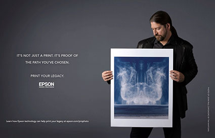
Check Your Inboxes! My Newsletter Insights Is Out!
Check your inboxes!
My free enews Insights features awesome printing tips and Epson’s video series on printing your legacy.
Plus there are new free resources – username (insert your email here) and password (free).
Sign up free.
10 Top Photography Pros On The Power Of Print
Jeremy Cowart
Gregory Crewdson
Loise Greenfield
Download The Digital Printing Quick Start Guide here.
Read more on digital printing here.
Learn more in my digital photography and digital printing workshops.
A Checklist OF Things To Look For In Prints
When you’re evaluating print quality, knowing what to look for is almost as important as knowing how to achieve it. Many technical factors contribute to print quality. Here’s a list of things to look for when you’re evaluating print quality – yours and others’.
It’s not that every one of these factors has to be optimal to achieve great print quality. It is that every factor you optimize enhances print quality further.
Well Focused
No Motion Blur
No Sharpening Artifacts
Extended Depth Of Field
Extended Dynamic Range
Appropriate Lightness
Highlight Detail / Separation In Values
Shadow Detail / Separation In Values
Mid-tone Contrast
Gradation
No Posterization
Low Noise
No Noise Reduction Artifacts
Believable Color … or … Color Transformed With Intent
Color Without Artificial Color Casts
Variation In Single Colors
Saturated Color
Appropriate Materials
Appropriate Scale
Appropriate Presentation Materials
Appropriate Contextualization
Appropriate Price
So what’s ‘appropriate’? That all depends on the statement being made. The real question is, “What is the artist trying to do? And how well did they achieve that?” You can successfully break the rules if you break them for a reason.
17 Top Printing Tips For Making Great Fine Art Prints
There’s no mystery to what it takes to make great prints. There are just many things to consider before making them and many steps to take while making them. Set clear objectives, map the process out clearly, master the skills in each step (or collaborate with people who have mastered specific skills) and you too will be able to produce great prints.
Here’ an overview of what it takes.
Paper / Substrate


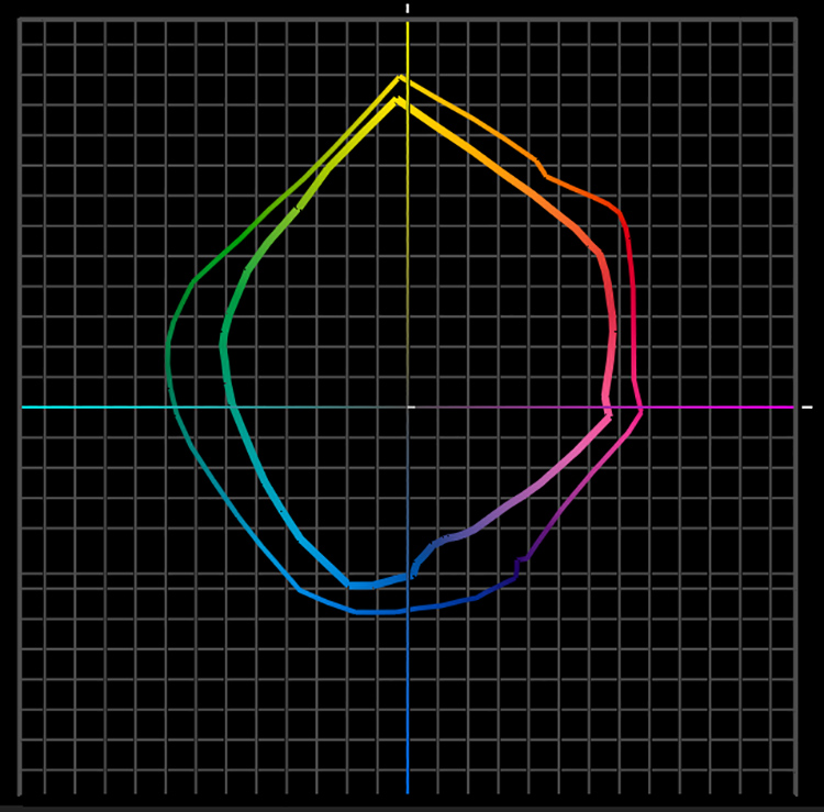
Epson K3 ink on Luster and Watercolor compared
There’s an art to making paper. Since its invention, thousands of years ago, paper has had a long and interesting history. There are many ways to make paper and many kinds of paper. We’ve found many ways to use paper – architecture, furniture, crockery, fashion, sculpture, and of course the display of text and images in a variety of forms. Contemporary printmakers don’t print exclusively on paper. There’s also canvas, wood, metal, and plastic too. Anything you print on could be considered a substrate.
Substrate dramatically impacts print quality.
Substrate determines white – ISO brightness. The white of the substrate determines the brightest values achievable and the quality of the highlights in a print. Some substrates have bright cool whites, while others have duller warmer whites, some are so dull they look antique. Short of bleaching or coating a substrate with a brighter substance, this is something you can’t change about the substrate.
Substrate has a dramatic impact on ink limit, how much ink can be put down before detail begins to be lost. Droplets of ink spread when they come in contact with paper and dry. Dot gain specifies how much a dot spreads. A dot spreads more on an uncoated paper than it does on a coated paper. A dot spreads more on a matte paper than it does on a glossy paper. Consequently, fine detail is more precisely rendered on coated glossy surfaces. In addition, very smooth surfaces render subtler gradations, without interference from ink spattering or textured surfaces.
Ink limit has a dramatic impact on black – dmax. More ink, blacker black, higher dmax ratings. Using Epson UltraChrome II ink, dmax on glossy papers is approximately 2.4, 1.8 on matte papers.
Ink limit has a dramatic impact on saturation – gamut. More ink, more saturated color, wider gamut. It’s important to understand where gamut is extended. The dmax and gamut on glossy papers is greatly expanded in the shadows and minimally reduced in the highlights. Put another way, glossy papers render significantly more saturated shadows and slightly less saturated highlights.
Most inkjet substrates are coated. Coatings involve complex chemistry. Coatings reduce the spread of ink, allowing less of it to sink into the base and more of it to sit up on the surface. Most coatings contain drying agents to increase drying time and reduce dot gain. Many coatings contain optical brighteners to render brighter, cooler whites and more saturated colors. Some optical brighteners actually fluoresce, emitting more light than they receive. You can tell if there are a lot of optical brighteners on a substrate if you view it under a black light and it glows. Many optical brighteners are not stable and prints made with them typically display reduced longevity ratings. If print permanence is a significant concern avoid them.
Substrate has a dramatic impact on longevity. Different substrates yield different longevity ratings. If longevity is a significant concern, research the most current data. Visit Wilhelm-research.com for a wealth of information from one of the most definitive and respected resources. Remember, when comparing data on longevity from a variety of sources, testing conditions must be comparable for comparisons to be valid.
For best results, print on the coated side of a substrate. How can you tell? If you can’t tell from the orientation in the manufacturer’s packaging and you can’t see a manufacturer’s logo on the back of the paper, wet your lips and press the paper in between them, the side that sticks most is coated. A few papers are coated on both sides. Printing on the uncoated side typically yields soft under-saturated results. Printing on uncoated papers yields similar results. You can coat your own custom substrates with products like Ink Aid. (See my review at www.johnpaulcaponigro.com.)
Today, you have an amazing array of substrates to choose from. The astonishing array of choices available for inkjet printers today should suit almost every need. With a single printer, you can print on surfaces that span the gamut, from matte to glossy. You’ll find fiber, plastic, and metal. Uncoated, hand-coated, mechanically-coated. Machine-made or hand-made. Silk, canvas, foil, and transparent mylar don’t seem exotic in comparison to the most unusual substrates people have tried to feed through their printers. I encourage you to experiment. Use some caution in your explorations as very fibrous substrates may clog print nozzles and you can damage print feed mechanisms with very thick substrates. While I don’t recommend you use third-party inksets, I do recommend you test third-party substrates. Because of the enormous industrial infrastructure required to mass-produce paper, most printer manufacturers don’t make their own substrates but instead partner with paper manufacturers to produce materials to their specifications. There are many fine companies that make papers specifically for inkjet printing; Arches, Cranes, Hahnemuele, Ilford, Innova, Legion, Moab, Museo, and Pictorico are just a few. New materials are being released every year. Some have unique characteristics. My recommendation is that you test many substrates. Make test prints using a representative image that contains the full spectrum and includes a neutral step wedge with specific values that will help you determine minimum and maximum printable densities. There’s only one way to truly find out how the look and feel of a substrate will impact your work – use it.
Above all, remember that looking is a sensual act. Aesthetics may win out over technical considerations. While it’s useful to identify quantitative criteria (such as ISO brightness, dmax, gamut, ink limit, and dot gain) other qualitative aspects of a substrate may be as or more important. Substrates come in various weights; some are so thick they don’t need mounting while some are so thin you can see through them. Substrates have different textures; some are wavy or ridged, some are woven or cratered, some are fibrous or fuzzy, some are very smooth. Some substrates have distinctive edges, such as deckling or excess fiber. Substrates have different reflectivities; some are so glossy they are mirror-like reflecting everything in front of them as well as within them, while others are extremely matte exhibiting no surface reflections. The material characteristics of a substrate may carry specific connotations; one may look synthetic while another looks organic, one may seem commercial while another seems artistic. These qualities, in combination with one another, may be extremely useful for enhancing the expressive characteristics of your prints.
Research your options thoroughly to help you make more informed decisions before you commit your images to print. It will be time very well spent.
Read more on digital Printing here.
Learn more in my digital photography and digital printing workshops.
Ink
It’s complex chemistry
The science of ink formulation is one of the most significant, if not the most significant, factors driving the current inkjet revolution. Ink is complex chemistry. It’s colorants (dye or pigment varying in type and density), resins (protecting colorants and reduce metamerism), mediums (suspending the colorants), solvents (increasing viscosity to deliver it through tiny nozzles), and drying agents (decreasing drying time and reducing dot gain).
Consider the currently reigning inkset for professional photographic inkjet printing – Epson’s UltraChrome HDR. Epson UltraChrome HDR ink’s exceptional pigment density delivers supersaturated colors and dense blacks unprecedented in photographic output, able to be delivered in small droplet sizes (2-6 picoliters – a picoliter is one billionth of a billionth of a liter), smaller than the width of a human hair, so quick drying that droplets form a precise dot and prints emerge from printers essentially dry, water and ozone resistant pigment is encapsulated to reduce light refraction and abrasion. High Gloss Microcrystal Encapsulation Technology is formulated into the inkset’s suspension technology to make the print surface more uniformly reflective despite dramatic variances in ink density throughout a print. While counteracting the tendency for gloss to reduce as pigment content increases, gloss-optimizing additives also increase translucency allowing higher ink density and chroma.
Epson still leads the inkjet revolution. Recently, there are competitors whose newest solutions and their immanent evolutions deserve serious consideration and monitoring – Canon’s Lucia inkset and HP’s Vivera inkset.
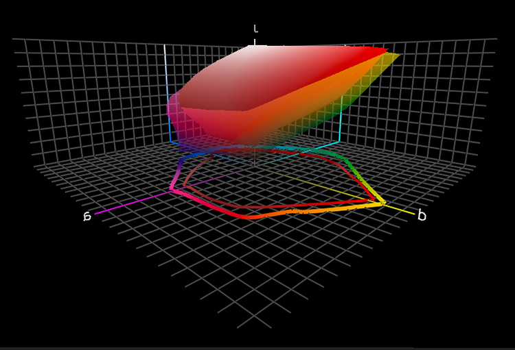
Epson K3 on matte and luster
Dye vs pigment
While there are profound differences between dye-based and pigmented inks, the differences in image quality are frequently overstated and sometimes misstated. Years ago, pigmented inks suffered from reduced gamut (saturation) and dmax (maximum density or black) and increased metamerism. Today the differences lie largely in the areas of longevity and durability, where pigment still reigns supreme. (Cost may also be impacted, as dye inks are typically less expensive to manufacture.)
Multiple inks
To improve gamut and dmax manufacturers have been adding more inks to inksets; alternate colors (variants of offset’s high-fi orange and green, light cyan and magenta, or red, green, and blue) and additional blacks (blacks optimized for matte and glossy surfaces, light and medium blacks or grays) are used in combination with CMYK.
Do more inks yield better image quality? Typically. But not necessarily. Image quality is the result of a combination of a number of factors. To assess print quality, you have to assess the total printing solution – ink, profile, rendering intent, driver, screening algorithm, ink limit and substrate. Compare gamut, dmax, ISO brightness, neutrality, graybalance, metamerism, gloss differential, bronzing, gradation, fine line detail, longevity and durability. Both the physical makeup of ink and its application are important.
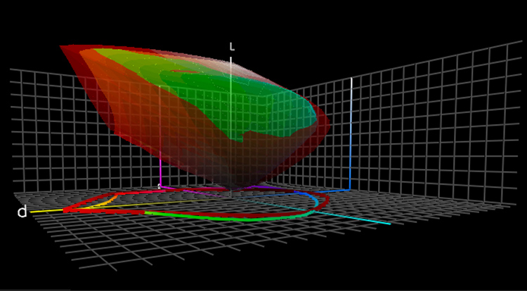
Gamut and dmax
The impacts of increased gamut and dmax are both easily seen. Gamut has a dramatic impact on color but not black-and-white print quality – more saturated color. Dmax has a tremendous impact on both color and black-and-white print quality – blacker blacks.
What is not obvious is that greater dmax extends gamut by increasing the saturation of dark colors.
Dmax and gamut figures for inkjet prints are at a photographic all time high. Both significantly exceed traditional print materials. (Dmax – silver gelatin 2.35, Epson UltraChrome HDR 2.45, Canon 2.5.)
Neutrality and graybalance
Inksets with multiple black inks not only deliver the best dmax, they also deliver the best neutrality and graybalance (consistent tint throughout the tonal scale). Producing truly neutral and consistently neutral colors with supersaturated inks is quite challenging; black ink becomes a stabilizing factor. While ink is an essential factor, it is not the only factor – driver’s and profiles play a significant role.
Highlight detail
Light inks, including light black inks, aid in the reproduction of highlight detail. They hold detail with not just smaller but also less visible dots.
Metamerism
Metamerism can be reduced with multiple black inks and heavier black plate generations (using more black ink to reproduce the image). Metamerism can be minimized by reducing the use more metameric saturated inks and increasing the use of less metameric neutral inks. Metamerism can also be subdued by coating irregularly shaped pigment particles with polymers, making surfaces more uniform and reducing light refraction.
Gloss differential
Gloss differential is an uneven sheen due to varying ink densities in highlights and shadows that affects glossy surfaces significantly more than matte surfaces. Gloss optimizing additives are incorporated into ink formulation to dramatically reduce gloss differential. It goes where ink doesn’t. It also counteracts the tendency for gloss to reduce as pigment content increases. It goes where ink doesn’t.
Sprays, coatings, and varnishes applied after printing can also help reduce gloss differential. When using these types of non-native chemistry guard against staining and poor adherence, the tendency towards additive failure (reduction of gloss, dmax, or gamut), and possible reductions of longevity. (Download a free PDF review of PremierArt’s PrintShield sprays at www.johnpaulcaponigro.com.)
Bronzing
Inkjet prints may display bronzing (an iridescent flash of colors seen at different viewing angles particularly noticeable in neutral areas). Heavier black plate generation and alternate screening frequencies (dot placement) dramatically reduce this.
Longevity
Dye ink achieves significant lightfastness and ozone resistance only with a limited choice of swellable papers, which are not water-resistant and prone to running in high levels of humidity. (Epson’s new Claria ink is an exception whose longevity ratings approach 100 years on a wide variety of substrates.) Pigmented ink offers superior longevity and durability with lightfastness, water and humidity resistance, and ozone resistance on all media (swellable, porous, rag). Inkjet longevity ratings are reaching new highs in photography (for color108 years, 166 years with PremierArt Spray – for black-and-white 284 years and 312 years with PremierArt Spray). (See wilhelm-research.com for more information.) Longevity is derived from a complex set of factors chemistry, adherence, lightfastness, and exposure are a few of the key elements. Where longevity is a concern, use tested materials whenever possible.
Durability
Durability can be seen as separate from longevity or an extension of it. Ink plays a role. Pigmented inks are prone to scuffing and burnishing. Sprays can reduce this tendency somewhat. Related issues such as scratching, cracking, flaking involve ink but are often more attributable to substrate. Handle with care.
Switching inksets
Choosing an inkset limits or determines your choice of printer model. While some printer models can accommodate more than one inkset (generally not simultaneously), printers are usually designed for a specific inkset.
Avoid switching inksets in the same printer, such as dye with pigmented or the printer manufacturer’s inkset with a third-party manufacturer’s inkset. Don’t confuse this with swapping inks within the same inkset, such as different ink cartridges of the same ink or different black inks designed for specific substrates, such as matte and glossy. Different inksets inevitably contaminate one another producing unreliable results and frequent clogging. If you do switch inksets, be sure to thoroughly flush a printer of all residual ink before installing a new ink type.
Epson K3 verus Canon Lucia
Third party inks
There are a number of third-party manufacturers who produce both dye-based and pigment-based inks – Lyson, MIS, Generations, ConeTech, etc. It’s nice to have a choice. Many users are happy with them. While these inksets often offer significant savings over the printer manufacturer’s inksets, I’ve never been as impressed with the quality they deliver. Third-party inks are prone to clogging. Longevity is often questionable. Using them sometimes voids the warranty on your printer. Buyer beware.
The bottom line
While it is only one factor you should consider when evaluating print quality, ink is of paramount importance. Choosing an inkset is one of the most important decisions you can make when selecting tools and materials to make fine prints with. Research your options thoroughly and explore all the related variables carefully before committing your images to print. Continue monitoring this rapidly evolving field. Its arc has been so stunning that in less than a decade, inkjet printing has changed the nature of the photographic print.
Read more on digital Printing here.
Learn more in my digital photography and digital printing workshops.