Color To Black & White Conversions – A Strategic Overview

Alignment XXIII


There are many ways to convert color images to black and white.
Here’s my preferred method.

1       Optimize Color

Start with an optimized color original; set black point, white point, and lightness; clear color casts; boost saturation to reasonably high levels; avoid clipping. Use Lightroom or Camera Raw.

2       Establish a Tonal Structure
Establish a tonal structure - the relative lightness and darkness of diverse image areas. For basic global conversions use Lightroom or Camera Raw. For advanced local conversions use dual adjustment layers – Hue/Saturation below Black & White.

(The primary goal of a black and white conversion is to set the overall structure of the tonal relationship in an image. During color to black and white conversions, you'll be tempted to perfect the lightness and contrast of an image. Resist this temptation, if it leads you to creating too much contrast, loss of shadow and highlight detail.)

3       Enhance Global Lightness and Contrast
Enhance global lightness and contrast, the relative relationships of tone, after you establish the tonal structure, the fundamental tonal relationships. Use Curves.


Insights Members can login to read the full article.
Email:
or Sign up

Free PDF – The Aesthetics Of Photographic Prints

AestheticsOfPrintPDF
Half of the battle is knowing how to do something. The other half is knowing what to do. When it comes to making fine photographic prints, the road has been well mapped by our predecessors. One of the best ways to educate yourself about great print quality is to look at a number of great prints (directly rather than through reproduction). And, to keep on looking. Education, or enrichment, is a dynamic, evolving, lifelong process. Every time you look, sensitively with awareness, your vision grows. There’s always something more to learn.
A combination of elements (and their relationships to one another) is often evaluated when assessing print quality. Speaking very broadly, you could say, it’s all about believably reproducing detail. Focus, depth of field, high dynamic range, tonality, color balance, elimination of process artifacts all play a role. So do the selection of appropriate materials, scale, presentation and contextualization. There’s a lot more to it than you might think at first and though there are no hard and fast rules there are conventions everyone should be mindful of. There’s also a lot of room for creativity.
All of this is expanded and detailed in this free PDF – The Aesthetics Of Print.
Subscribe to Insights enews and download it free.
Learn more in my digital photography and digital printing workshops.

Why Make Prints ?

WhyMakePrints

This is an excerpt from my article on Digital Photo Pro.

Why Make Prints ?
Making prints does so many things for your images. How many things? Let me count the ways …
They’re …
Sensual
Prints enhance your images with material qualities and the associations they bring with them.
Sizeable
Prints define the scale of your images.
Durable
Historically, it’s the images that were printed that survived.
Salable
Because they’re physical, prints are easily bought and sold.
Exclusive
Images in print are more rare, as well as less accessible.
Presentable
Prints encourage images to be viewed in different ways.
What Making Prints Can Do For You
When you make a print, you consider your images more carefully for a longer period of time and often multiple times. This adds up. It’s quite likely that along the way you’ll find many ways to improve your images. Repeat this process many times, and you’ll find that your vision as a whole will improve.
Read more on Digital Photo Pro.
Learn more in my digital photography and digital printing workshops.

Masterworks In My Collection – Ansel Adams – Clearing Winter Storm, 1944

adams_clearingwinterstorm425

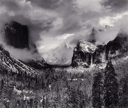
Ansel Adams’ Clearing Winter Storm, 1944 is a particularly interesting photograph to me because of its complexity. It’s a specific kind of complexity. Like many other complex images, it’s made of a lot of separate elements but is still unified. Unlike many other complex images, it can be broken into many separate images, each complete compositions in themselves; four peaks in clouds, one vertical monolith in clouds, shadowed valley between monolith and peak, waterfall and peak, waterfall and two trees, etc. (Try finding as many separate compositions in this single image like this as you can.)

When you look at prints of Ansel Adams’ Clearing Winter Storm many assumptions about the medium, the man, and his work are confirmed and challenged. It’s neutral, perhaps even slightly cold in tone, which is appropriate for the subject. The tonal scale is high contrast and full scale, perhaps heavier than expected with very full highlights and it may be surprising that some shadow detail is not preserved. The large format original renders detail well, though there are traces of visible grain in light smooth areas. There’s detail throughout the image (deep depth of field, sharp focus, full scale printing); when it was printed this may have been the sharpest image quality possible while today it looks classically smooth in comparison to new high resolution digitally sharpened images. At 16×20” it’s a medium scale enlargement, not a contact, and could have been printed larger; that it wasn’t is an interesting reflection on both the man and his times. Print quality becomes not only a window into the past of the subject but also into the medium, which this man above all others epitomized for his time.

(There’s a lot to be learned from looking at originals, which is why we look at masterworks from my collection in all of my  digital printing workshops.)

Find my comments on other Masterworks In My Collection here.
Learn more in my digital printing workshops.


Printing 101 Notebook – Ron Martinsen


“Ron Martinsen is an internationally renowned commercial photographer who has educated over 800,000 visitors on his popular Photography and Photoshop blog. His printing series last year was a huge hit, but there was so much great information to share that his loyal readers asked for a book. Printing 101 Notebook: An Introduction to Fine Art Photography Printing is an eBook that is designed to help frustrated ink jet printer users get the most out of their investment by educating them on everything they will need to make great prints.”
Ron Martinsen’s ebook Printing 101 is packed with digital printing tips and tricks, peppered with links to more resources. In a casual personal tone he offers advice based on his real world experience. While the book is applicable to photographers using any inkjet printer, it offers more information on Canon printers than any other source I’ve encountered. The supporting interviews with industry leaders in printing offer even more information from a diverse group of individuals.
Find out more about Ron Martinsen here.
Get your copy of the Printing 101 Notebook at Flatbooks.
Learn more with my free digital printing ebooks.
Learn more in my digital printing workshops.