Download your free copy now!
Explore the wonderful world of black-and-white, a special form of color.
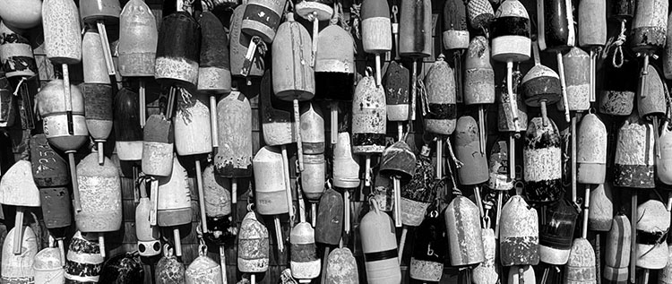
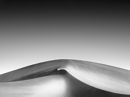
Seeing In B&W
What’s unique about black-and-white, and how to best adjust and print it.
What’s Unique About B&W
Black-and-white is special in so many ways.
Expanding The Definition Of B&W
The term “black & white” is not as simple as you might think.
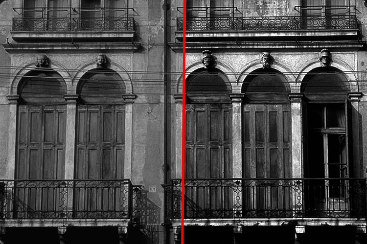
How Gray Is Gray ?
Both context and personal preference make this a surprisingly challenging question.
Why You Need To Understand Color To Get The Best B&W Images
Color affects the exposure, processing, and printing of black-and-white images.
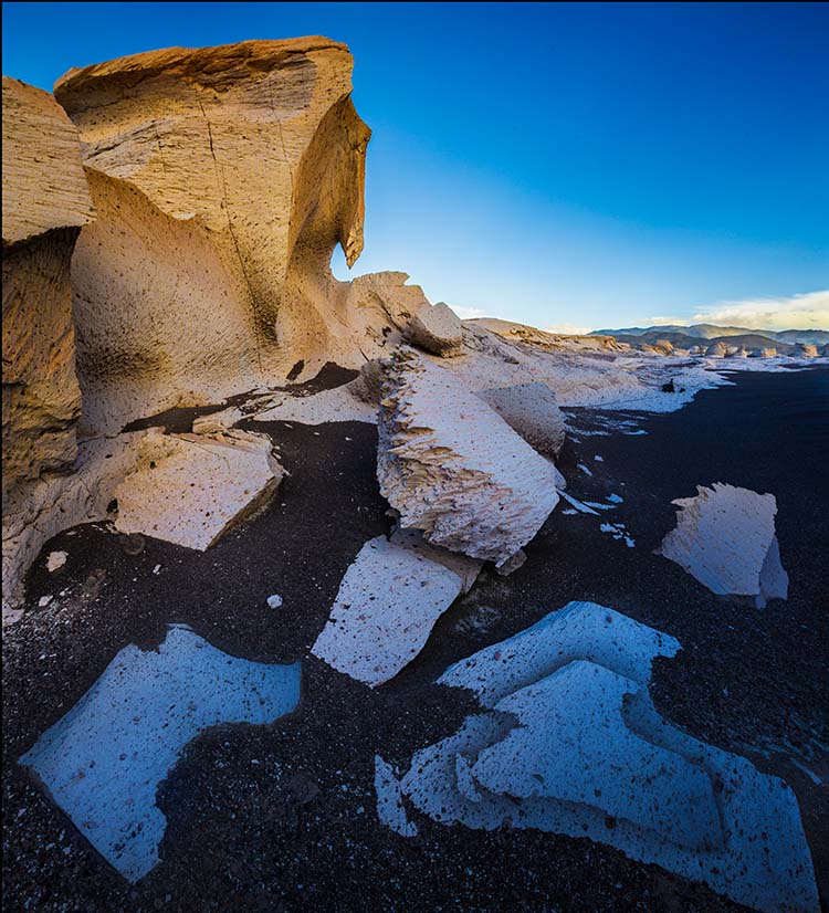
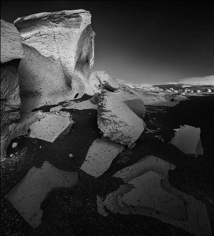
An Overview Of Color To B&W Conversions
My preferred workflow for color to black and white conversions.
Optimizing Files Before B&W Conversions
Prepare your color images before conversion to black-and-white to gain maximum control.
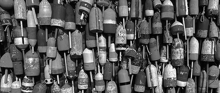
Why Desaturating Is The Worst Color To Black & White Conversion Method
Simply desaturating reduces tonal separation.
A Dozen Ways To Convert Color To B&W – And Why You Only Need Two (Coming Soon)
Simplify your workflow.
Lightroom / Camera Raw – B&W Conversions (Coming Soon)
When global conversions are enough.
Photoshop – B&W Conversions
When you want to localize conversions.
How To Create The Best Color To B&W Conversion Previews
Exploring your options before you commit to a final solution is time well spent.
Simulating Infrared | .99
Create the look of infrared with Adobe Photoshop (all versions)
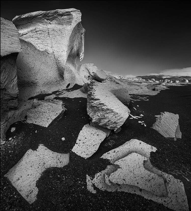
Enhancing Local Contrast In B&W Images
The best ways to dodge and burn detailed.
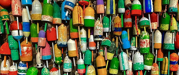
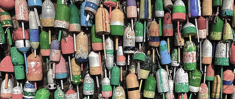
5 Strategies For Adding Color Back Into B&W
Why and how to add color back into black-and-white photographs.
Top 5 Ways To Add Color To Black & White
By adding color to your black-and-white photos, you can enhance their expressive qualities.
Hand-Coloring B&W Photographs (Coming Soon)
How to achieve complex and convincing effects with this compelling palette.
Black & White Signature Styles
Like so many other artists, you, too, can learn to craft a unique black-and-white look.
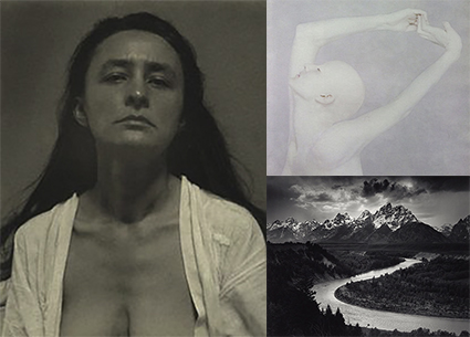
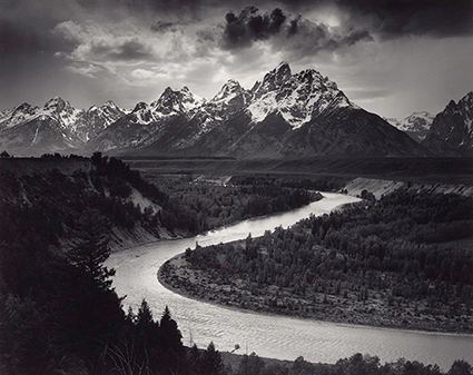
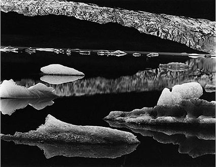
5 Photographers With Signature B&W Styles
Study the masters to find new possibilities in black-and-white photography.
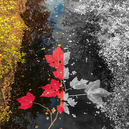
Why B&W And Color Don’t Mix
They’re two different realities; unless you use them as a code for that, present them separately.
Epson Driver – Advanced B&W Photo
Use the Epson driver to make the best black-and-white prints.
Watch The Essence Of B&W Mastery
Sign up for Insights for news of new content!