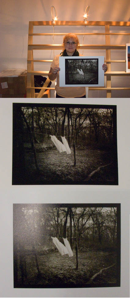
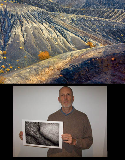
Jim Graham – Next Step Alumni Group Exhibit


John Paul Caponigro’s Next Step Alumni Group
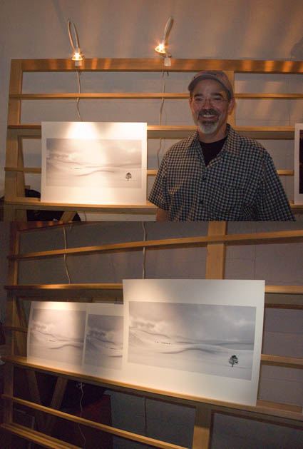
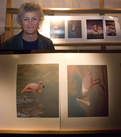
For over 10 years I’ve been mentoring a select group of individuals. Their progress has been thrilling to watch. It’s been a true privilege to be a part of their growth. July 7 their first Group Exhibit will be unveiled at the Maine Media Workshops. (link)
Jim Graham has been a member for over 6 years. Here’s one important thing he learned and his work.
Alumni Insight

I first came to John Paul 8 years ago.  And from that workshop and my subsequent inclusion in the Next Step Group  I have been able to develop a voice that speaks through my work.  John might say that I always had one and that he only helped untie the strings that has bound it.  But, I’d argue differently.
My inclusion in this group helped in my ability to articulate a visual language.  An Artistic language.  For I do believe that when we least expect it, life sets us a challenge to test our courage and willingness to change, to hear and to see; at such a moment, there is no point in pretending that nothing has happened or in saying that we are not ready. The challenge will not wait.
And it was not only John Paul who taught, but each member of that group as teacher.  Each offering their own individual gift to the other. Each part having their own unique attributes that bound us all together.  Not just a whole community but a visual chorus.
I’ve also been fortunate that others have valued my input about their work and that curiosity has given me the courage to begin to teach on my own.

Artist’s Statement

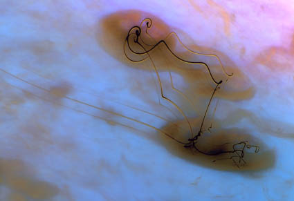
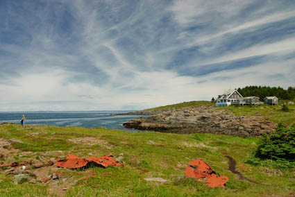
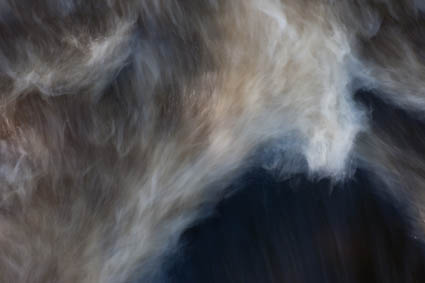
The work I choose to show in a gallery is typically made while traveling. I usually just photograph whatever interests me. Documenting where I am or what my surrounding environs are.  The resulting imagery inevitably ends up integrating my experience with the natural world. I seem to have an inner agenda, which is always seeking a harmony between the two, as well as a need to reconcile the inner, psychological world with the outer world of my everyday experiences. Each of my images has it’s own story.  I may not have known the story when I released the shutter.  But, the journey home and the time taken to suss out the images I have created, each stories unfolds.  They are perhaps an afterthought – a way to make sense of a fleeting moment or a memory.
In the naming of my images I try to give a bit of meaning to the moment I’ve tired to render.  I try to find a way to finish the image as a final piece and to bind the group as a whole. Each image has it’s own place and it’s own narrative.  While I have my own story for each, I hope that the viewer find his own stories within them.
See more of Jim Graham’s work here.
See the Next Step Exhibit at the Maine Media Workshops July 7 – 30.
Stay tuned for individual and group Next Step Blurb books.
Find out more about my workshops here.
Read More

Workshop Review – Along the Waterline

At the end of my field workshops we do rapid fire reviews of the work done that week. Everyone puts in at least 6 images. We don’t know who’s pictures we’re looking at. We call out star ratings fast getting a quick first impression. Then we state quickly and simply why the image works or doesn’t work and how it could be improved. You get honest feedback and many diverse perspectives in a minimum amount of time. At the end, we sometimes look at all the images of each individual grouped together; suddenly new connections are made; sometimes images work better in context with one another than standing alone. The process is really enjoyable and educational.
Here are a few of the standouts from the week.

Anne Davey, having identified unifying elements in an extend portfolio review before the workshop, knew with confidence she would always be obsessed with color. But she took a risk in exploring pure abstraction this week.

Jim Brewster, after years of professional work for others, reconnected with his authentic voice this week, “I took ME off the shelf.” Initially he was documenting situations without composing them. With a little prompting he put the two together.

Sam Krisch enjoyed exploring a guiding metaphor, in his case a Kafkaesque paranoia. It gave him a subjective sensibility to unite many diverse experiences.

William Barek continued his explorations in photo-impressionism.

Rob Sylvan found many ways of connecting to story and themes with words helpful to find new perspectives and a deeper sense of connection in his images.

Jeff Fox admitted he was obsessed with structure and was torn between abstraction and representation
Alumni can read his comments on my Facebook Alumni group here.
Learn more in my field workshops.
8/9-15 – Iceland … 10% discount ends June 20.
10/16-19 – Fall Foliage … 15% discount ends August 15.

Special Guests – Greg Barnett & Patti Russotti


Having special guests always adds extra positive energy into an already dynamic mix. Special guests Greg Barnett and Patti Russotti, both long-time high-level educators at RIT with vast experiences in the medium and it’s digital evolution, participated in my recent field workshop Along the Waterline. Their presence and the receptivity of the students encouraged me to ramp up the curriculum to an even more advanced level conceptually. We moved progressively varying our modes of inquiry, to identifying ways of looking, focussing on themes, and identifying ways to make the finally images more psychologically loaded. Each day built upon the previous one. At the end, everyone had increased their skillset, learned a lot of different ways of looking, and deepened their authentic voice. It’s great to see everyone progress together, all in different ways. It was really stimulating for everyone involved. In many ways, both small and large, it will change my teaching for the better.
Greg and Patti mind at the end of the week here.
“Over the last few days while working with John Paul, I’ve had somewhat of a breakthrough …”
Read More

Facebook Group – John Paul Caponigro Alumni


I started a Facebook Group for my workshop and seminar alumni.
If you’re one of my alumni you can use this group to …
Network – Connect and stay in touch.
Learn – Exchange information.
Promote – Grow an audience for your projects.
I use Facebook to stay in touch with people. I let them know what I’m doing. I find out what they’re doing.
My hope is that this group will be useful to you to … Read More

Kathy Beal – Alumni – Antarctica


Kathy Beal has a thoroughly unique approach to making images, capturing out of focus fields of color on location and using them as a jumping off point for creating unique compositions in Photoshop. Though still inspired by specific places and their palettes, her images take you to entirely new places with a palette all her own.
Kathy’s one of my long standing alumni who has come so far so fast it’s thrilling to watch! It took a combination of many things to make breathroughts – commitment, research, persistence, risk, courage, feedback, sensitivity, passion, and the most important of all hard work. But she enjoys what she’s doing so much, it doesn’t seem like hard work. She’s become incredibly productive, producing thoroughly unique work. Her growth can only be described as an explosion of creativity.
Check out more of Kathy’s work from Antarctica here.
Check out my workshops here.

Olaf Willoughby – Alumni Success Story


Olaf Willoughby is one of my workshop alumns with an amazing success story. It’s a testament to how one man with focus can succeed personally and make a significant contribution in a short time.

“It all started with the mesmerising impact of a photographic expedition with Michael Reichmann and John Paul Caponigro. Antarctica was even more dramatic than I had expected. Glowing pink light at sunset. The vivid blue depths of the ice. Drifting sculpted icebergs. It was almost like a fairytale.
But the reality is different. Antarctica is under threat. Apart from the impact of climate change; the accords on land exploitation, whaling and tourism are all on a course of seemingly irreversible change for the worse.
This contrast between splendour and sadness led me beyond a photographic portfolio to produce a 48 page colour book, a work of environmental advocacy. “Antarctica, A Sense of Place”. The images and text contrast the natural beauty with the dark detail of the dangers facing Antarctica.
I produced the book within 6 months of the trip but I was still only halfway. John Cage said he didn’t consider his music complete until someone had heard it and similarly I needed marketing to create awareness and demand.
The World Wildlife Fund endorsed both the book and the images, using them in its web and print marketing activity. They also distributed over 5000 copies of the ebook on CD to help raise money for environmental causes. I have also blogged for the International Polar Year and their web site has featured the images. Additionally an article on the trip appeared in the UK’s most popular photographic magazine, Amateur Photographer, who also gave the book a very favourable review. A selection of images were exhibited at the ‘White Worlds’ exhibition at Nature In Art in the UK, Summer 2008. Prints have also been sold to support corporate environmental marketing programmes.
Through the WWF I have managed to create a good level of awareness, far higher than I might have managed on my own. I am going again in Jan 09 with John Paul and am currently planning the second edition.
JP’s workshops bring together a wonderful collection of like minded artists, rich with different talents. There are many benefits but, for me, the one outstanding lesson has been the expansion of the way I ‘see’ images, both provoking me to push harder and allowing me greater freedom to express my vision.”
Olaf Willoughby is a photographer, writer and researcher who lives with his wife Monique in London, UK. Creator: the WIT test of individualists and team players used in market research. Author: photography & travel books and articles. Values: the need to connect, environmental advocacy. Interests: the rhythms of data, images and words fuse into a long term fascination with creativity and pattern detection.
Check out a recent feature on Ag magazine here.
Find Olaf’s book here.
Learn more at olafwilloughby.com.
Stay tuned for stories from our upcoming January 2009 voyage to Antarctica.

Enjoy my Antarctica galleries, book, and statements.
Learn more about my workshops here.
Early registrants get discounts at home.
Members get discounts abroad.

Peg Fredi – Simulating Alternative Processes / Waxing Prints


This week at The Fine Art of Digital Printing workshop (taking place at Brooks sponsored by Epson) Peg Fredi wanted to simulate the look of the alternative process prints she’s been making with digital contact negatives. She tried several toning solutions – variations of traditional warm toning solutions. She found that she like the black of the inkjet prints, which is even blacker than alternative process blacks. She tried several paper types, ultimately deciding on Epson Velvet paper, which she then planned to wax (with butcher’s wax) to enhance the surface further. Actually, waxing print surfaces has been around a long time. It adds an extra dimension and quality to any print. And it doesn’t affect longevity. It pays to experiment. You may find new solutions that are just right for your work.
Have you finished your prints in unusual ways? Tell us about it! Comment here!
See Peg Fredi’s work here.
Look for upcoming Epson Print Academy dates here.
Check out The Fine Art of Digital Printing workshops here.
Check out my Fine Digital Print workshops here.

Steve Robeck – Thinking File Structure


This week at The Fine Art of Digital Printing workshop (taking place at Brooks sponsored by Epson) Mac Holbert and I reviewed file structure at the end of the week – by processing student work. Everyone participating in the workshop got a valuable review of the file building workflow Mac and I use and recommend. Steve Robeck also got more than one possible window into the art of interpreting digital files. Time and time again, you modify how you apply a tool, eliminate it from the process, or add another. In this case we added a Photo Filter adjustment layer applied selectively to the highlights to add subtle warm ambient color and we used an additional Hue/Saturation layer to increase the saturation of yellow accent colors throughout the image. Adopting a consistent file structure and working methodology is important. And, knowing when and why to make exceptions is equally important.
Look for upcoming Epson Print Academy dates here.
Check out The Fine Art of Digital Printing workshops here.
Check out my Fine Digital Print workshops here.

Carlos Conseco – Print Surface


This week at The Fine Art of Digital Printing workshop (taking place at Brooks sponsored by Epson) Carlos Conseco discovered how important it is to test materials and evaluate images side-by-side. He printed one of his best images on a variety of surfaces – Epson Watercolor, Velvet, Ultrasmooth Fine Art, Luster, and Exhibition Fiber. They were all good. Each material added something new to the expression of his print. Materials affect print quality in technical ways (glossy papers produce blacker blacks) and aesthetic ways (matte papers seem softer and more organic). So he slept on it before making his final decision. The most important thing he learned was that materials matter.
What papers do you like? Why? Comment here!
Look for upcoming Epson Print Academy dates here.
Check out The Fine Art of Digital Printing workshops here.
Check out my Fine Digital Print workshops here.

Cheryl Medow – Consistent Style


Cheryl Medow creates wildlife composites. She’s attending the Fine Art of Digital Printing workshop (Caponigro and Holbert at Brooks sponsored by Epson). Yesterday, some of them looked like photocomposites (surreal) and some looked like paintings (graphic). Today, after a long discussion about the most successful components in separate images and the intent she wants to communicate, they all look like they’re made by the same person who has a cohesive message. Some of the keys to unlocking her style included keeping shadow and highlight detail extremely full (none of them pure black or white, sometimes with significant color). In addition to keeping luminosity contrast low, she did the same with hue contrast, glazing the different colors in her images with a single color. Both create a more softly modulated color palette. Cheryl had to reconsider what she had learned about traditional photographs to find her own personal style. Her first step was to find the words to describe the new qualities she found through exploration (trial and error) and now wanted to repeat. The next step is to ask why. She’s got a lot of ideas, but she’s still working on it. That’s great. That’s when work starts to get really interesting.
Check out Cheryl Medow’s work here.
Check out the Fine Art of Digital Printing workshops here.
Check out my Fine Digital Print workshop series here.