Alumn Cira Crowell – Exhibition & Book – "Envisioning Ecstasy"

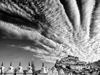
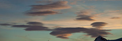
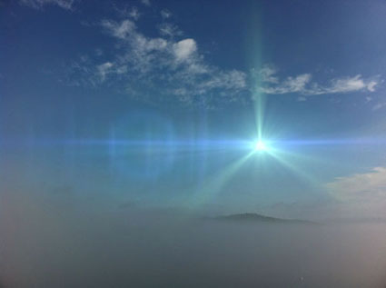
Cirrus Above Thiksey

In the summer of 2013 I had the fortune of travelling to Ladakh, India, a remote Himalayan kingdom that is now far Northwestern India, bordered by Pakistani controlled Kasmir and Chinese controlled Tibet.  Ladakh’s high desert rises from valley floors at 12,000 feet to the mountain peaks at 20,000ft. Water from the Indus River is skillfully directed through lush fields then on to irrigate countless other valleys in India. The Ladakhis live in carefully organized communities of adobe homes where they maintain cattle and yak, pashmina goat herds, make mud bricks for export, hone their traditional crafts, keep cultural ways of life and practice an intense spirituality.  It is a place where monasteries seem to float above military bases and vast expanses that shimmer in the intense, clear light. Translated as “The Land of High Passes” Ladakh is a region of sunshine and snow, of dark temples and bright spirits.

I happened to meet fellow photographer Christopher Michel in Delhi when he was doing what he does best, photographing people with his happy-go-lucky-how-could-you-say-no direct approach.  We happened to have the same somewhat unusual camera and lens combo so I struck up a conversation.  Little did I know we would be traveling to the same place and often shooting standing shoulder to shoulder with several thousand other people.

Faster and Faster

One hundred and fifty thousand ethnic Tibetans were gathering in Ladakh for the ancient Kalachakra ceremony, a two thousand year old ten-day teaching given by Tenzin Gyatso, the 14th Dalai Lama.  I went as a student of life, to see and experience with camera in hand but no specific assignment or shot list.  It was not easy.  The mid-summer heat of India was as hard on the equipment as it was on the attendees.  It was difficult to breathe, move, and photograph in the dust, smoke, heat and an international crowd of so many, packed into a tight space and hurrying over long distances to get there.  There were near mob-scene moments as well as times of great kindness that transcended language barriers.  The intense sun cast deep shadows in the desert while the traditional adobe architecture had dark interiors often only illuminated with butter lamps and a single strong shaft of light.  The experience was overwhelming and required great openness to each moment, the physical stamina to endure heat and altitude as well as the willingness to play well with others.  

Every extra moment from sunrise to starry night was spent exploring the stupa fields, monasteries, city of Leh and village life with friends met along the way.  Chris’ focus on the essence of each moment was an inspiration and his photographs reflect his incisive eye, whether the subject was people or place. During the two weeks in Ladakh we did not share work or even review our own images.  There was limited electricity for anything beyond charging batteries.  Several weeks later I happened to come across a blog article about Chris’ work in Ladakh and immediately suggested a collaborative show to benefit Tibetan culture at Tibet House US.  Fortunately Chris agreed to my out-of-the-blue request and the curator of Tibet House US, Zola Nyambuu, was happy with the show we proposed.  So began the coincidental collaboration of “Envisioning Ecstasy.”

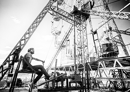
The show has forty black and white photographic prints of landscape, portraits and details of Ladakh during the Kalachakra.  These range from arid desertscapes to lush irrigated fields reflecting the mountains.  There are images from the Kalachakra as well as incongruous graffiti overlooking the capitol city, Leh.  Curious camels, luminous nightscapes and the famously painted Indian trucks balance the spiritual iconography.  A traveling circus with a lotus-decorated ferris wheel loomed above the vast desert providing an unforgettable personal and photographic experience.

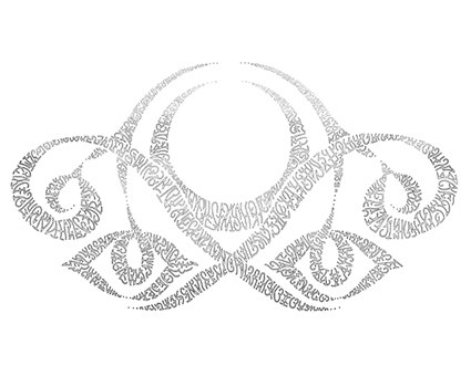
“Envisioning Ecstasy” also has a conceptual aspect in the form of eleven large-scale lumenographic prints based on illustration based photographs originally sketched during the Kalachakra.  Two projected animations bring these drawings to life and complete the show. The story behind many of the documentary images was captured in Chas Curtis’ keen videograpy.  Chas’ evocative timelapses and captivating clips from ceremony to circus were seamlessly edited into a luminous video interview by Kyle Ruddick. The video is a multi-media presentation of “Envisioning Ecstasy” and will be screened at the opening. The show is accompanied by a catalog, Envisioning Ecstasy and a clothbound book, 108 Visions : Ladakh During the Kalachakra, thoughtfully designed by Michael Motley, which offers glimpses of the journey from small details to sweeping vistas.  Books and print sales benefit Tibet House US, which brings the concept of collaboration full circle. 

CCrowell_ClearLightMind_425px copy

All of this work was greatly enhanced by John Paul and Seth’s dynamic duo Art of Processing and Art of Creativity. The workshops are an intense immersive experience for honing artistic vision, voice and direction.  And of course any workshop with JP and Seth is a lesson in that all important art of playing well with others, one of my favorite photographic mantras.  Photography is often seen as a solitary pursuit and though it has it’s quiet moments, communal creativity widens the collective perspective. This golden rule underpins the entire show of “Envisioning Ecstasy.” 

“Envisioning Ecstasy” opens at Tibet House US, New York, May 20 from 6-8pm and is on exhibit until June 26. Two publications will be released for the show: a catalog, “Envisioning Ecstasy,” and a hardcover book, 108 Visions: Ladakh During the Kalachakra.  Please contact Tibet House US regarding show information and books. 

Learn more about Envisioning Ecstacy on The Leica Blog.

Find out more about Cira Crowell here.

Read more Alumni Success Stories here.

Green Action – Limit Light Pollution


Be more green!
You can make a difference today!
Make many small changes to make one big change!
And you’ll save a lot!
Take action now!
Here’s one idea.
Limit Light Pollution
Did you know that we could save electricity,live healthier and save wildlife by just flicking a switch?
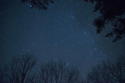
New studies have suggested that light pollution has started changing the behavior of many nocturnal animals.  Many birds not only navigate by the magnetic north but they also find their way by following the night stars during their nocturnal migrations.  Unfortunately with so much outdoor lighting in any of the worlds countries – these bird groups are  becoming increasingly confused and flying into tall buildings and towers. in   In 1981,the light drenched smokestacks at the Hydrox Generating plant in Ontario, Canada. caused the deaths of 10,000.00 birds.  The U.S. Fish and Wildlife Service estimates that 4 million to 5 million birds die this way every year.
This environmental danger is not just restricted to wildlife.  It has been discovered that many people  suffering with sleep disorders, depression, insomnia, cardiovascular disease, and cancers stem developed their diseases from the alteration of the circadian clock caused by night-time lighting.  Other studies including two that were done in Israel have concluded that there is a correlation between breast cancer and outdoor lighting. these showed that women living in highly lite areas had a 73% higher risk of developing cancer then women from living in less outdoor artificial lighting areas.
So what happens when we start limiting our outdoor lighting?  Starting this July the French Government will become the world leader in preventing light pollution. With the hope of saving approximately two terawatt/hours of electricity per year the country will be mandating all commercial interior lighting to be turned off one hour after the last worker leaves. This, in conjunction with the turning off of all storefront and window lighting by 1am should save enough of electricity to light 750,000 homes.
Read more about the health effects of light Pollution here.
Read more about the wildlife toll of light pollution here.
Find more resources that will help you take action now here.
Find environmental organizations to support here.

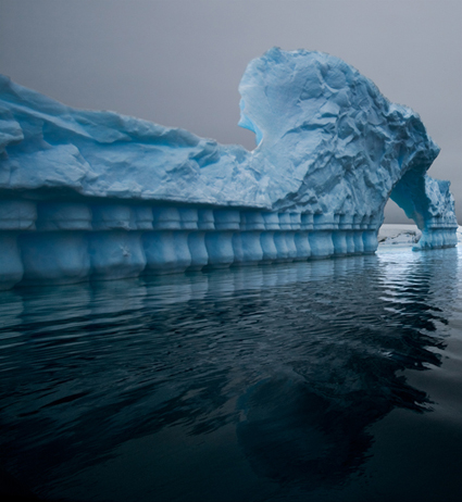
The Changing Antarctic Light


As I set sail on my fifth voyage to Antarctica I’m wondering what the light and weather will be like this year.

In 2005 we had crystal clear skies that lit up with sunset color for 4 hours.

In 2007 we had weeks of low hanging clouds and low lying fog.

In 2009 we had high thin clouds that diffused the light with a golden glow.

In 2011 we had rain, sleet, hail, snow – if it was wet it was in the air.
Now, in 2013, I’d love to be surprised with something different. But what would that be? A combination of the intense color of 2005 and the sculptural form of 2007?


Each voyage, I’ve hoped for at least one calm passage across The Drake. They have a phrase to describe this body of water –  “lake or shake”. I’ve only seen the “lake” in the colorlful photographs of Eliot Porter and I’d love to see it with my own eyes and make my own photographs. Though I’d be happy to continue “paying the price” to visit Antarctica, I’ve had enough “shake”, which is one reason we plan to fly to Antarctica in 2014.
Discover our 2014 fly to Antarctica sail south of the circle workshop here.

Encourage Plans To Evolve

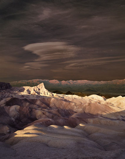
Oriens I, Death Valley, California, 1999

I missed the shot(s) the first time. When I got back from Death Valley, a friend said, “Zabriskie Point? Again? Well, I’ll bet you could photograph it in a way that hasn’t been done before.” I knew what she meant, but her comment actually clarified another idea for me.

I had been deeply impressed by the way the light changed mercurially over time, continually transforming the landscape from pre-dawn through early morning. It first lit the blue-gray sky with pale pinks, then turned the far mountains from a cold brown to a hot coral, crept slowly across the valley floor to set Manley Beacon on fire (the crescendo in a magnificent symphony of light that most photographers favor), and continued to create moving pools of light in the foreground during a process that lasts for more than an hour. It is a wonder to behold and to fully appreciate it, one needs to be still and vigilant for some time. Its full impact cannot be found in a single moment. I found it in many.

The solution? Make multiple exposures of the same composition throughout changing passages of light and then blend them together to create the impression of an extended moment in time.
I had made exposures of sunrise at Zabriskie Point, but I hadn’t made the ones I needed now. I had to go back. It took a year and a half. Knowing that so many unexpected things often happen, I prefer to make flexible plans, so I wondered if I would return for an idea that ultimately wouldn’t work. I envisioned glorious light in every layer of the landscape. As I began making the exposures, I realized there was a flaw in my plan. If I selected the ‘best’ light in every area of the picture, all areas would demand equal attention. There would be no contrast. The final image needed shadow just as much as it needed light. I persisted, making exposures, without moving the camera for more than an hour, of every significant change in light – and shadow. My original plan was useful but it needed to be modified as it was executed based on specific conditions, new information, and insight. To succeed, I had to listen not just what was in my head but also to the place and the process.

Later, as I looked at my transparencies, the final solution presented itself. This new solution even highlighted my feelings about the place more strongly than my original idea. The result, different from my initial conception but consistent with my intention, achieves a dramatic lighting effect never before seen at one time. Yet, throughout time, a similar sequence of experiences has been witnessed countless times by so many.

The light on the foreground is unaltered, or to be more accurate, I should say is faithful to the transparencies that recorded it. The separate portions have not been modified substantially, nor were they modified unequally – there has been no dodging and burning. Instead, the light has been reorchestrated with time, faithfully representing the existing light(s) but changing what can be seen in a single moment.

Nothing in the foreground, midground, or background has been added or removed. The sky, however, is an addition from another location. I found the smaller sliver of sky contained in the original exposures made the composition cramped. It lacked the vast sense of space found in the desert. The sky had in fact, been the first indicator of the presence of the coming light, making a thousand transformations before its arrival. But the sky that morning was not particularly noteworthy. I could have spent a lifetime waiting for the perfect sky. I chose instead to incorporate another sky from another location that supported both the composition and the light. This sky I altered dramatically, both in tone and color. I did so to expressively complement the drama of the light below, to support it and not detract from it. While the lower half of the image is a matter of resynchronization, the upper half is a matter of recontextualization.

Neither method (resynchronization or recontextualization) yields a classically objective document. However, the results of their application may yield artifacts that are truer to our experience of events than traditional photographic practices. If applied in specific ways, they can represent certain aspects of events more faithfully, such as the passage of time.

Making this image changed the way I think about and experience the essential elements of photography – light and time.

How many ways can thinking more predictively about change aid your creativity?
How many new ways can you think about the fundamentals of your medium?
How can planning increase your creative success?
What can you do to encourage your plans to evolve?

Read more The Stories Behind The Images here.

Render Sophisticated Light FX With Rays


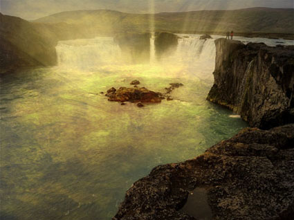
As far as magic moments go, few can compare to those fleeting moments when light streams from the heavens or wraps around objects, as if making visible some some divine presence. Kings and priests would pay dearly for the ability to place such signs at their command. You can have it for the simple price of an app.
Rays identifies highlights within an image and uses them as sources to render rays of light from …
Read more here.
Plus find more app reviews.

Dual Apps Render Sophisticated Light FX – Lens Flare & Lens Light


When it comes to photography, you can do a lot with a little light. Adding light into your images offers many creative possibilities: add a sparkle to someone’s eyes, make highlights shine, enhance an atmospheric effect, trace a constellation in the sky, render a cinematic special effect, and much, much more. In short, you can enhance the center of attention in any image or create a new one.
Adding light into your photographs after exposure just got easier on your iPhone. Brain Fever Media makes two apps that can add light fx to your images: Lens Flare and Lens Light.
Lens Flare offers 45 different effects — mostly star patterns, some edge flares, and a few linear streaks.
Lens Light offers 54 different effects including rays, spotlights, streaks, scratches, and even suns, moons, and lightning.
Read more on The Huffington Post.

Controlling Your Environment


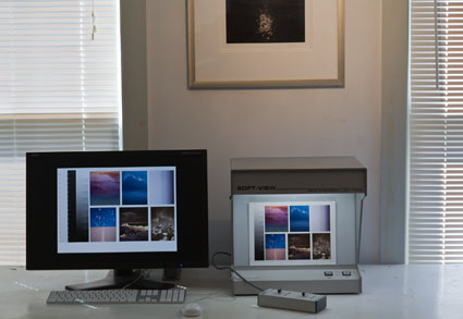
One critical aspect of color management has nothing to do with either hardware or software. It’s the environment you work in. Control your environment and you’ll control the color you see. Desktop, walls, decorations, fashion, viewing light, secondary light sources, ambient light – it all matters.

Keep It Neutral
Color influences color. This is sometime physical, when filtered or reflected color alters the appearance of another. This is always perceptual, when our eyes adapt to the presence of multiple colors. That’s right. Surround one color with another color and you’ll experience the color differently. You can’t measure this change in the physical world because the change takes place inside your eye/brain. Simultaneous contrast is a perceptual adaptation that you can’t turn off, but you can be aware that it’s happening, understand how it’s influencing you, and minimize it’s effects.

How? Surround yourself with neutral colors; they influence our experience of other colors least. Neutral colors produce the least contamination and the least adaptation. And, medium gray values produce the least brightness compensations of all neutral colors.
You may be tempted to make the appearance of your computer desktop colorful and lively. That’s fine for many non-color-critical tasks. However, when you’re adjusting color, make your desktop neutral. You won’t be able to see the color you’re adjusting accurately unless you do. If you don’t want to change your desktop use Full Screen mode, to hide the desktop and surround your image with a neutral color. (One downside to this is you’ll only be able to view one image at a time.)

Walls and decorations of any significant area should be neutral in appearance too. Make walls and decorations neutral. For the purposes of controlling your environment, any neutral color is better than a saturated color. You could opt for white, gray, or black. Don’t opt for designer whites, grays, or blacks, which contain trace amounts of hue and saturation that can still influence your perception enough to be significant. Choose neutrals. (If you’ve got a favorite image (poster, photograph, painting, etc) that’s colorful, position it out of your field of vision while you’re adjusting color.)

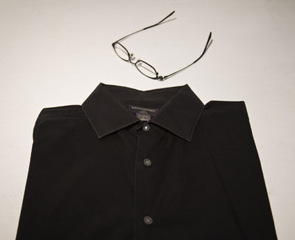
Don’t forget fashion. Wear neutral colors. If you wear bright colors, they’ll influence your perception too, especially if light reflects off of them and onto your surroundings or images.
Light It Well
The most important thing to control in your environment is light.
After all, light is what produces your sensation of color.
Viewing light, secondary light sources, ambient light

It stands to reason, for viewing color accurately, you want white light not filtered or colored light. (Don’t wear sunglasses or tinted glasses when adjusting color.) But what many people don’t consider is that not all white lights are created equally.

You’ll want to consider the amount of light – measured lux. It’s better to have too much light than too little light; colors will appear dull if you don’t use enough light; just don’t produce glare or make viewers squint. A CRI of 90 or higher is recommended.

Next, consider the color temperature of light – measured in Kelvin degrees. While 5000K is the industry standard (most viewing boxes and printer profiles are built for the 5000 K standard), in real world situations very few people view printed color under 5000K light. More typically, prints are viewed in galleries and museums in some form of halogen (3300K – 3800K) or in homes under tungsten (2800K) with a mix of daylight which varies with time of day, weather, and season. Viewing light for the end user is often highly variable. So, what do you do? Make prints for a specific lighting condition if practical. Otherwise, standardize on a viewing light temperature that can be least adversely affected in as many real world situations as possible. More people prefer the taste of 3600K than any other light temperature.

Finally, consider a light’s spectral distribution – smooth or spiky when graphed. White light can be mixed with different combinations of colored lights. This rarely affects the appearance of neutral colors, but it may have a significant effect on saturated colors. Light sources that contain only a few spectral frequencies (spiky or limited) will increase the apparent saturation of the colors they contain and decrease the apparent saturation of the colors they don’t. Light sources that contain all spectral frequencies (smooth or full) will render all colors without bias and won’t produce relative saturation distortions. Full spectrum light (sunshine, tungsten, some halogen) makes colors appear clearer and more saturated. (See my free ebook review on Solux lighting at www.johnpaulcaponigro.com.)
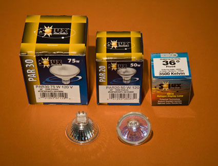
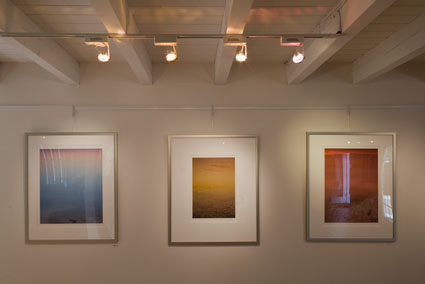

Secondary light sources should also be considered. Avoid backlighting; don’t position your monitor or proofs/prints with bright light sources behind them. Eliminate reflections; use blinds for windows and reposition lights that reflect off monitors. Reduce glare and flare as much as possible. New colorimeters (like Ax-Rite’s i1Display Pro and ColorMunki Display) compensate for these factors during monitor calibration and constantly measure and adapt to changes in these factors over time. Make your viewing experience as easy as possible. If you’re serious about color, you’ll plan to look a lot.

With a few careful choices you can make sure your environment supports your efforts to see and adjust color precisely every day. It’s time well spent. Without this attention to detail, even the most sophisticated color-management systems may be compromised. With this attention to detail, you can rest assured that you’ve done everything physically possible to control color. In a controlled environment, your color will truly shine.


Read more on Color Management here.

Learn more in my digital photography and digital printing workshops.

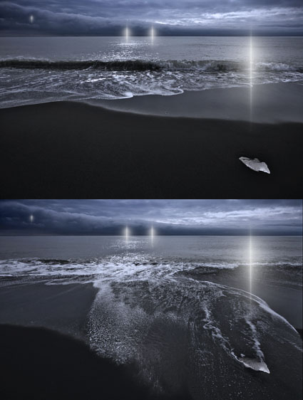
New Image – Refraction LXXVII


I issue quantum editions of select images from my series Refraction; the viewer can choose how many and which versions they would like created for them.
To date most of these editions offer variations in the number and position of the lights within them. In this image, variations in states of the background are presented.
Changing states and different rates of change are important themes in all of my work.
I find reversal to be the most rewarding creative strategy. Whether it succeeds or fails, I always learn something valuable from trying it.
Read my ebooks Reversal and Breaking the Rules.
See more new 2011 images here, here, here, and here.
The exposures for this image were made in Iceland.
Learn about my Iceland digital photography workshops here.