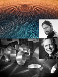
Justin A. Hartford – Next Step Alumni Group Exhibit
For over 10 years I’ve been mentoring a select group of individuals. Their progress has been thrilling to watch. It’s been a true privilege to be a part of their growth. July 7 their first Group Exhibit will be unveiled at the Maine Media Workshops. (link)
Justin Hartford has been a member for the past 2 years. Here are a few important things he learned from other members and his work.
Alumni Insights
1) Kathy Beal taught me to respect, ask permission, and thank the land that I am photographing. Keeping this practice helps to bring a sensitivity to my work that otherwise would not be there.
2) At the first Next Step summit I attended in Utah, many of the attendees suggested I work with self-portraiture. This suggestion has helped guide me down a path that I otherwise might have been scared to go.
3) Shooting along side many different Next Steppers has shown me different ways to approach photography and to see my subject.
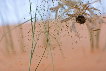
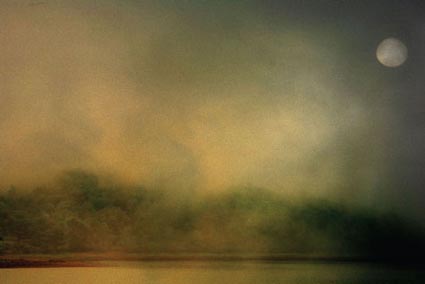
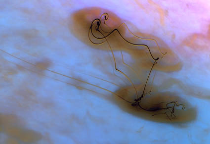
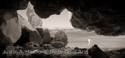
Artist’s Statement
Proserpina is a Greek Goddess whose name means “to emerge”. She is synonymous with springtime when she emerged from her six months of residing in hell. This series is about how we as humans so often stay in our own caves not letting the real us be seen so that we can be accepted by society. It can be comforting to stay hidden away and not be judged. It can also create an inner hell to keep who we really are deeply hidden away for fear of judgment.
See more of Justin’s work here.
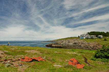
See the Next Step Exhibit at the Maine Media Workshops July 7 – 30.
Find out more about my workshops here.
Read More