HDR Aesthetics
HDR imagery is expanding today’s photographic aesthetics. Identifying the characteristics of contemporary HDR images will help classicists and pioneers alike. The basic ingredients are desirable for both sensibilities, but in varying combinations and to different degrees. As with solving any problem, it’s easier if you break it down into it’s component pieces and then learn what each one does and how they interact with one another. First know what to look for. Second, know what a tool can do. Third, know how to apply a tool. Once you’ve done this, you’ll be well along the way to crafting a unique style that’s all your own.
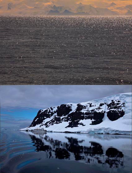
Pronounced Shadow and Highlight Detail
Accentuated Edge Contrast
Accentuated Texture
Increased Noise
Smoothed Texture
Saturation Distortions
Read more in the current issue of Digital Photo Pro.
Learn these and other techniques in my workshops.
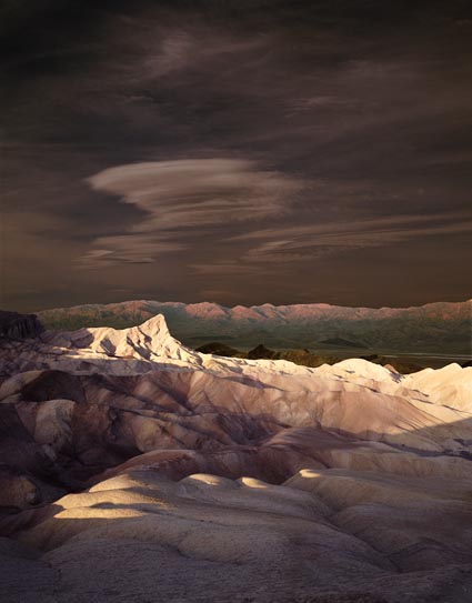
LDR
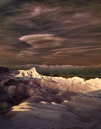
Half HDR
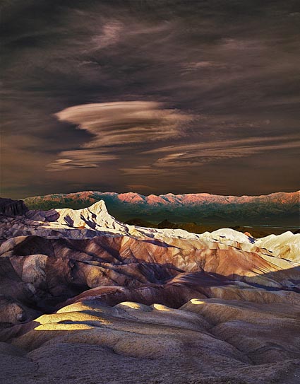
HDR Simulated
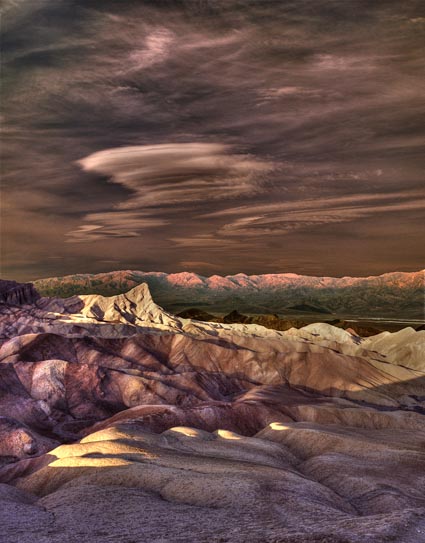
HDR Simulated With Photomatix