Prints are produced by not one but many things – a system. You can make better prints if you understand how each of the tools you use to make them influences quality. In addition, you’ll be able to identify and come up with solutions for problems you run into, now or in the future.
I’ve written whole articles on each one of these components (Follow this article with the individual ones you’d like more clarity on.), nevertheless, rather than having to piece all of that information together, I find it’s also useful to have a broad overview of how the whole system works.
Here’s a quick survey of why each element of a printing system matters.
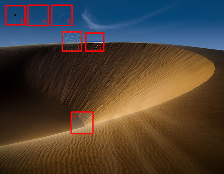
Camera resolution – dynamic range – bit depth
Lens sharpness – low distortion – few artifacts
Editing Space saturation
Bit Depth gradation
Software color – detail – composition
Monitor accurate preview – saturation – brightness of white
Printer ink – size
Ink black – saturation – longevity
Paper whites – materials
Printer Profile accurate color – graybalance
Light how well you can see
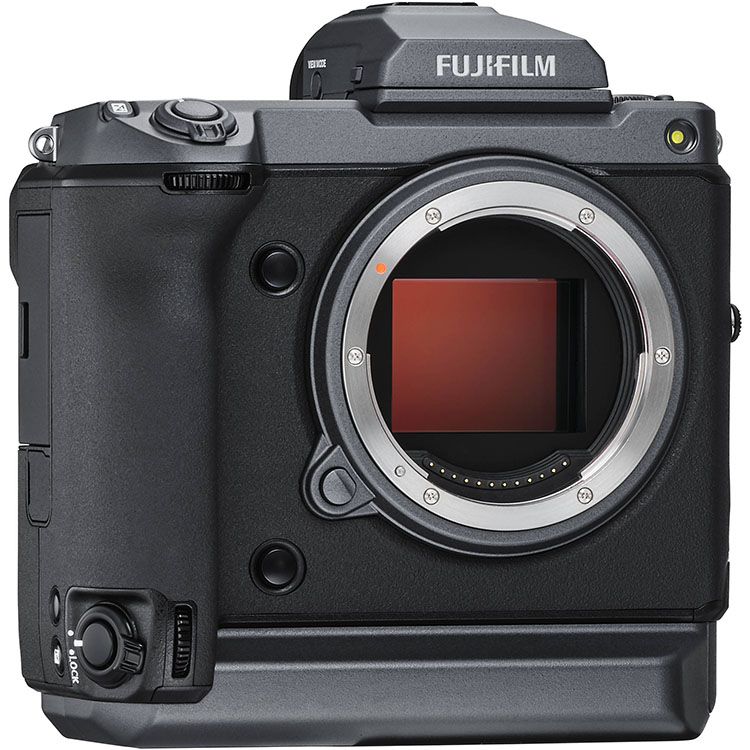
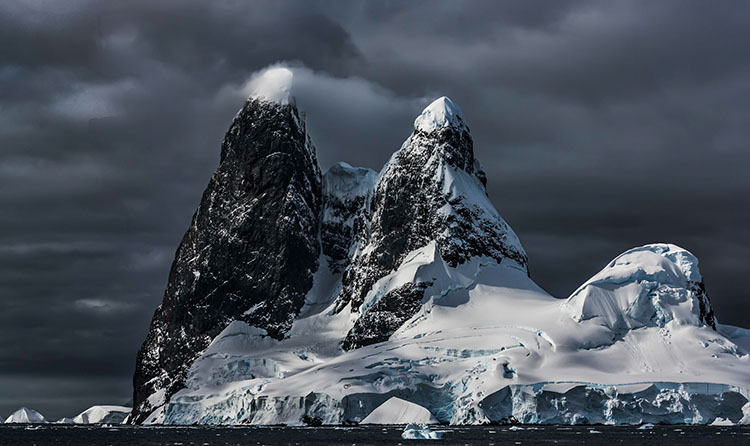
I’m currently testing the Fuji GFX 100
100 mp / 14 bit / ISO 12,800 expandable to 102,400
Camera
resolution – dynamic range – bit depth
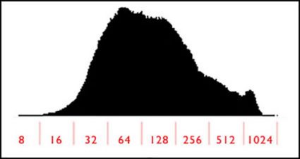
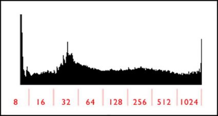
A camera’s chip determines how much detail it can render with three primary characteristics – resolution (sharpness), dynamic range (shadows and highlights), and bit depth (gradation). More is better. It’s easier to throw away what you don’t need than create it.
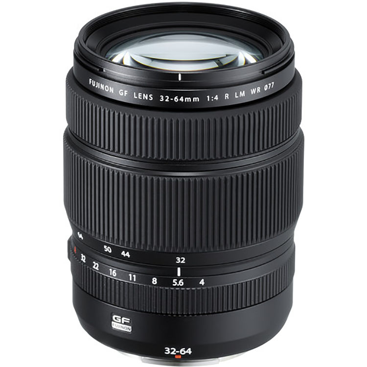
Among several lenses, I favor the Fuji 32-64mm
Lens
sharpness – low distortion – few artifacts
Good lenses are sharper, better lenses maintain that sharpness edge to edge, while the best lenses also produce beautiful bokeh (depth of field blur). Good lenses are also free of distortion and artifacts like chromatic aberration. Fixing these things in post-production can sometimes be arduous and at a certain point impossible.
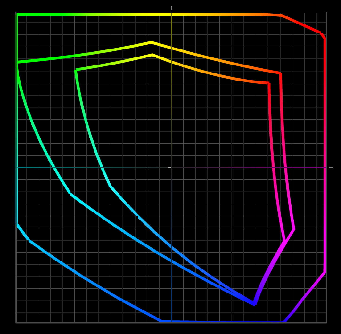
Prophoto is bigger than Adobe RGB and sRGB
I edit in ProPhoto RGB
Editing Space
saturation
Pro-Photo RGB can hold all of the saturation your camera can capture while other standard editing spaces cannot. If you use one of the smaller spaces (like Adobe RGB or sRGB) you may lose and not be able to produce that saturation.
Read more here.
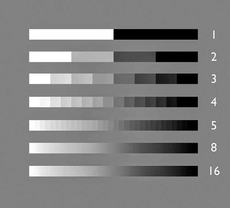
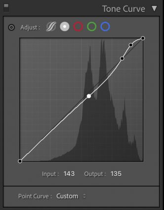
I edit in 16-bit
Bit Depth
gradation
16 bit’s thousands of shades of gray don’t give you more separation in prints. Printers can take 16-bit data but they can only print 256 shades of gray. Editing in16-bit eliminates the possibility of producing posterization (which can produce harsh graphic transitions and/or noise).
Read more here.

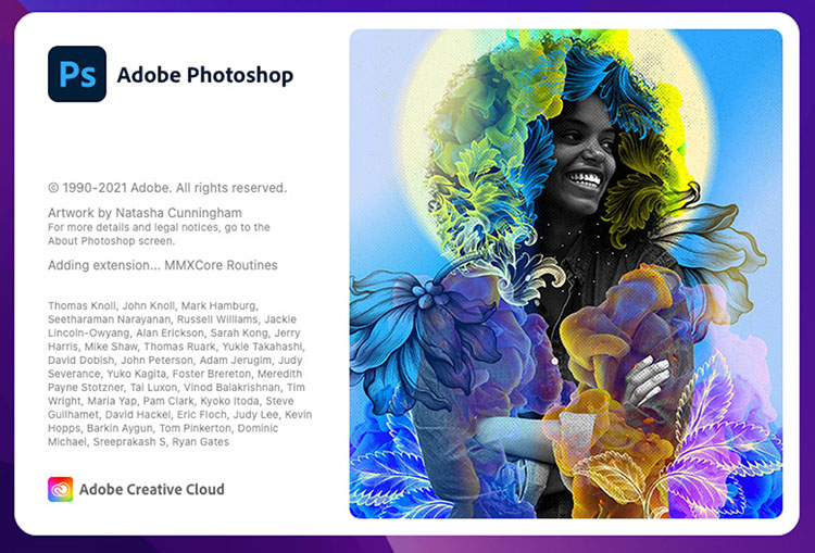
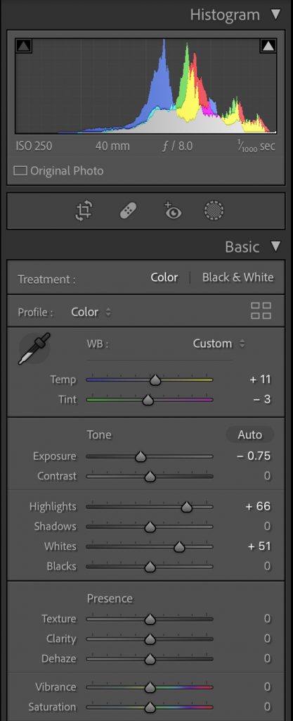
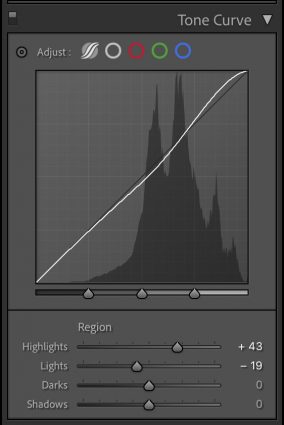
I use Adobe Lightroom Classic and Photoshop together.
Software
color – detail – composition
You can pretty much change anything about the way your images look … for better or worse.
Good software lets you be more precise and go further. Better software does it more easily without cutting corners.
For traditionalists, it’s shadow and highlight detail, midtone contrast, color clarity, sharpness and reduced noise.
For non-traditionalists, it’s the ability to produce unique color palettes, special effects, and composites.
Read more on color here.
Read more on detail here.
Read more on composition here.
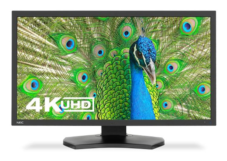
I use an NEC PA311D
Monitor
accurate preview – saturation – brightness of white
What could be more important than seeing your images accurately while you’re editing them? Good monitors can be calibrated to a device neutral standard that shows you what your images truly look like now and in the future (when you replace your current monitor).
Better monitors render more saturation. (Currently, the best monitors can show you almost all of the values in Adobe RGB.)
The best monitors can be tuned to show you the white of your print more accurately.
Read more here.
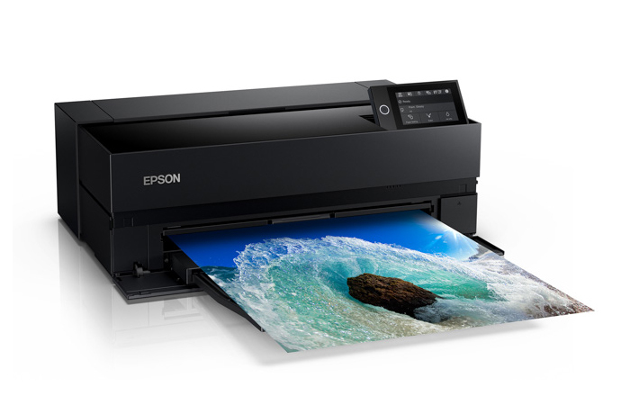
I use Epson’s P900 and 9000
Printer
ink – size
A printers manufacturer determines which ink set you’ll use.
A printer’s series determines which of the manufacturer’s inkset you’ll use.
A printer’s model determines how big you can print.
Additionally, a printer’s head also impacts speed.
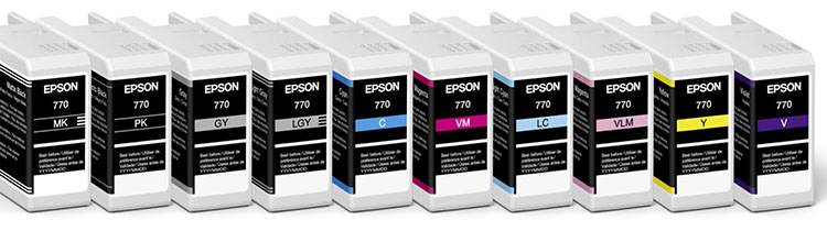
I use Epson’s Ultrachrome HDX ink
Ink
black – saturation – longevity
The ink you use has a huge impact on print quality and longevity … but to see what it can do you need paper.
Read more here.
Ink & Paper
black – saturation – longevity
Together, ink and paper determine …
Black
The black of the ink and the white of the paper set the limits of a print’s contrast ratio.
No matter how much ink you put down on some substrates you won’t get a blacker black and each substrate has an ink limit, which is the maximum amount of ink that can be put down before detail starts being lost.
Saturation
Good inks and paper coatings produce more saturation in all colors.
Longevity & Durability
Some are more archival than others. (Visit Wilhelm Research for reliable data.)
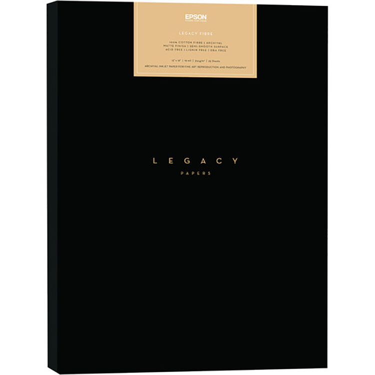
I use Epson’s Legacy Fibre and Legacy Platine papers
Paper or Substrate
whites – materials
Substrates determine an image’s white (where the ink doesn’t go) and so contrast ratio. A brighter, bluer white is more versatile, but may or may not be as archival.
Only paper (or substrate if it’s canvas, plastic, metal, wood, etc) can give your images a look and feel. It’s first and foremost about the physical characteristics of materials including things like reflectivity and texture.
Read more here.
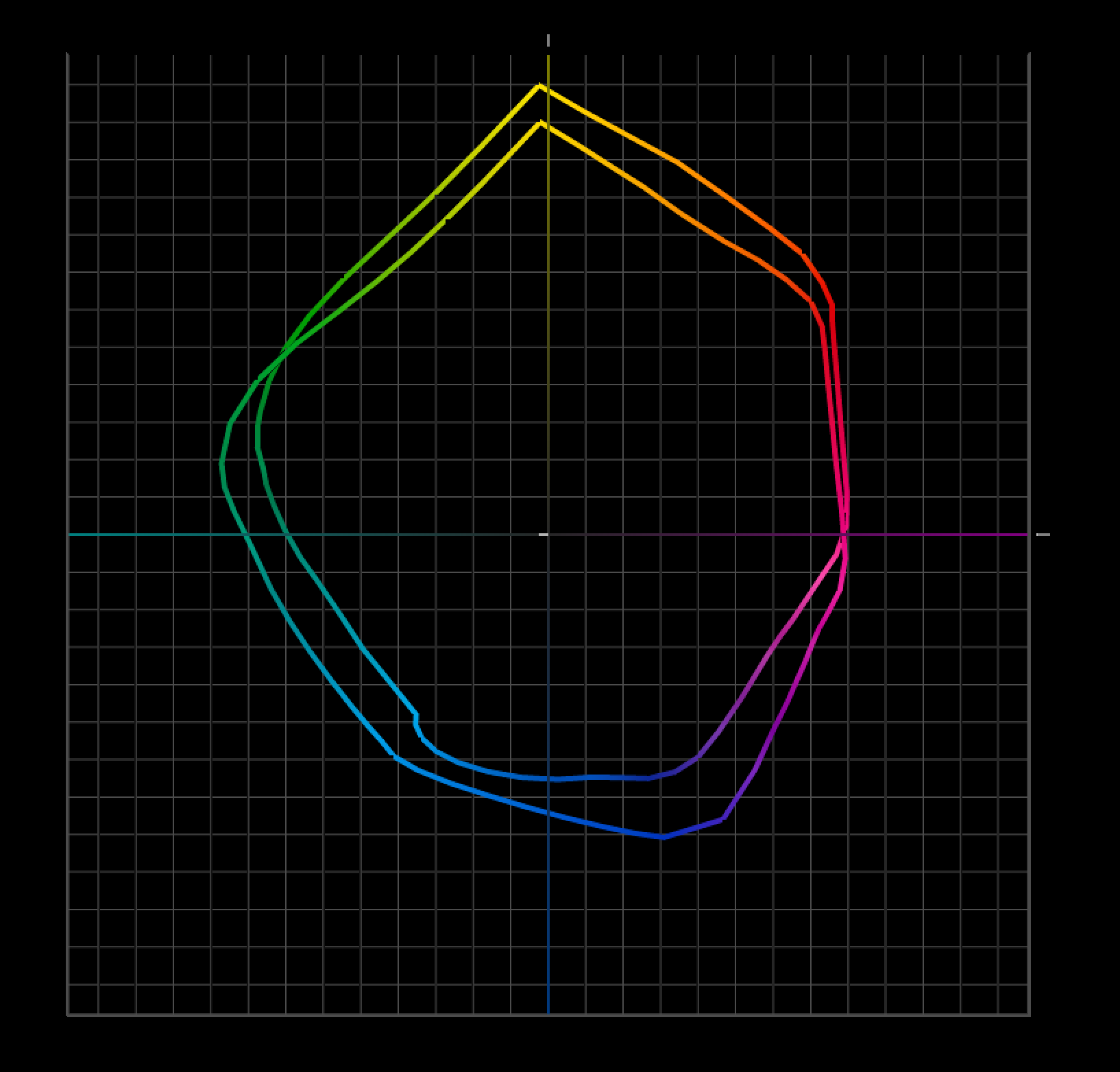
Photo papers have greater gamuts than matte because of their blacker blacks.
I use Epson’s profiles
Printer Profile
accurate color – graybalance – gradation – shadow and highlight detail
A good profile can be more than getting a good match with your screen. But it can be more. Poor profiles can cause color shifts, reduce saturation, produce posterization, and even lose shadow and highlight detail.
If you’re using Epson profiles for Epson papers, you’re in good shape. Epson makes great profiles for their papers. But if you’re using a third-party or hand-made substrate you need a good profile. Don’t assume that the profiles you download from websites are good. Test them. If they’re not great, get a professional to build one for you. Or, build your own.
Read more here.
I use Solux 3500K lights
Light
how well you can see good results
Event the best print can’t be seen in the dark. To be seen well, good prints need good light.
Think about three things …
1 Use a generous amount of light. Not so much light that it creates eye strain but use a lot. Good prints glow when they reflect light but they need enough light to create that glow.
2 Use the right color temperature. If you can’t control the light people view your prints in, assume it’s warmer than 5000K (most people prefer warmer light, like 3500K) and make your prints look good in a similar light.
3 If you really want to dial in the color for your exhibits (or your clients) recommend a full spectrum light source (like Solux) that doesn’t make one color look more saturated than another and so preserves the color relationships you produced in your prints.
Read more here.
It takes some initial research and testing to find the tools that are best for you but once you settle on a system of your own you only occasionally have to repeat this and only for specific components. It gets easier because you have a baseline. All you have to do is ask how much better can the new gear do and is it worth the cost and effort?
Meanwhile, if you run into issues (like my blacks aren’t black enough or my colors aren’t saturated enough or I’m losing detail) you’ll know which pieces of your system to tweak to get better results.
Read more on Color Management here.
Read more on digital Printing here.
Learn more in my digital photography and digital printing workshops.